Process
I meticulously executed a comprehensive design process for this large-scale project. The process was divided into six distinct stages: User Research, Information Architecture, Wireframing, Layout Design, Design System Development, and Prototyping. Throughout the project, I collaborated closely with a diverse team of stakeholders, project owners, developers, and designers from around the world.
The project was executed in a highly collaborative, agile environment, utilizing design sprints to efficiently iterate and refine our designs. Each stage was executed with a user-centered design approach to ensure that the final product met the needs and expectations of our target users. The end result was a unified, responsive product that improved usability, brand recognition, and cost savings in the development of new applications and functions.
Steps
Please choose the following steps to discover the implementation of the project.
As a UX/UI Designer, user research is crucial to understand the target user's needs and behaviors. I conduct research through methods such as user interviews and persona creation to gain insights that inform the design process, identify design opportunities, validate assumptions, and empathize with the user's experience of the CELOS system. Additionally, persona creation helps to clearly define and understand the target user, guiding the design process and ensuring the final product meets their specific needs.
Please select filter for more content.
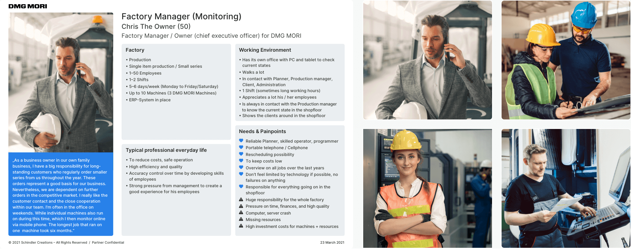
I conducted targeted user interviews to gather valuable insights and feedback on the existing CELOS product. The data collected from these interviews was organized into six key categories: user quotes, software product usage and user roles, demographic and psychographic characteristics, factory information, working environment, and user needs and pain points. This information was then used to create six detailed target personas, which serve as a useful tool for ranking features and making design decisions. These personas provide a clear understanding of the target user and their specific needs, allowing for a more user-centered design approach.

I meticulously crafted six fictional yet accurate representations of our target users, known as personas. These personas serve as powerful tools to foster empathy, raise awareness of our target users, and guide design decisions. I collected data from target user interviews and organized it into relevant categories, such as user demographics, psychographics, pain points, and needs. I then used this information to design detailed persona cards, complete with appropriate images and a PDF A4 summary for easy reference. These persona cards will be integrated into the DMG MORI design system platform and made available for all team members to utilize in their design decision making process.
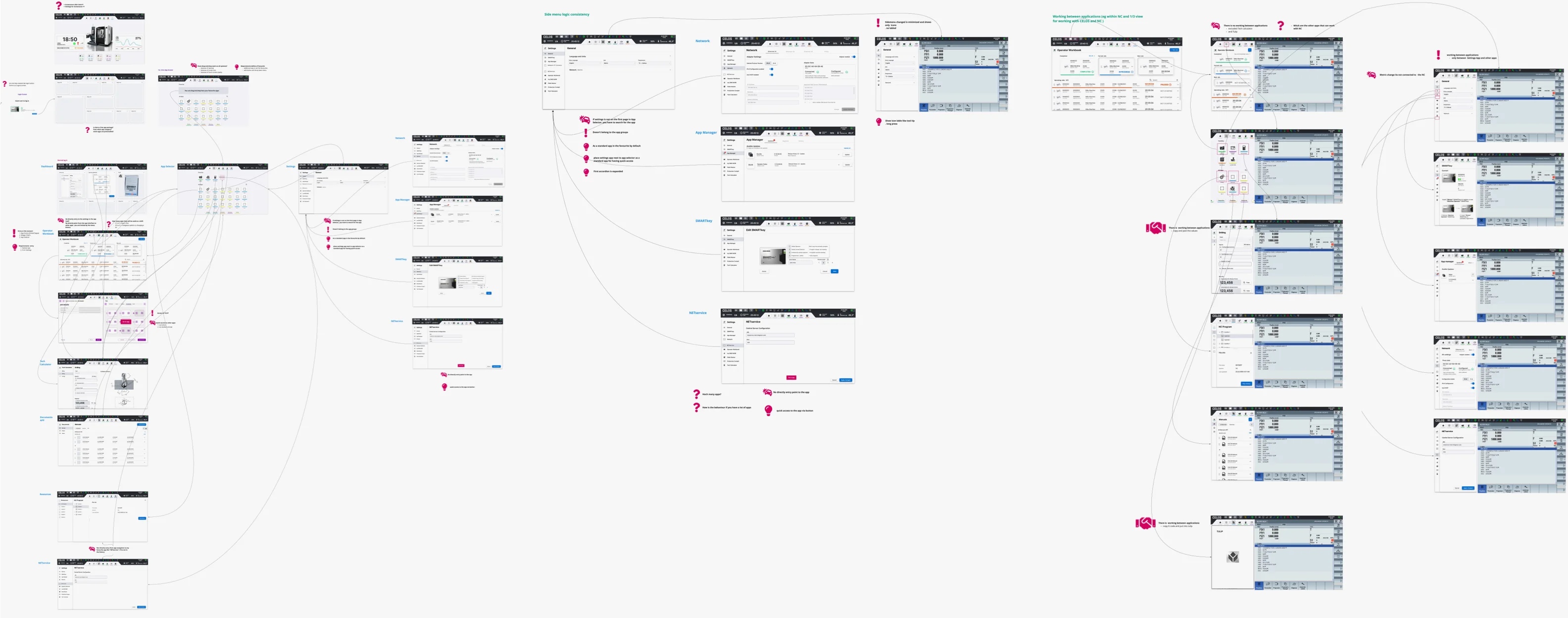
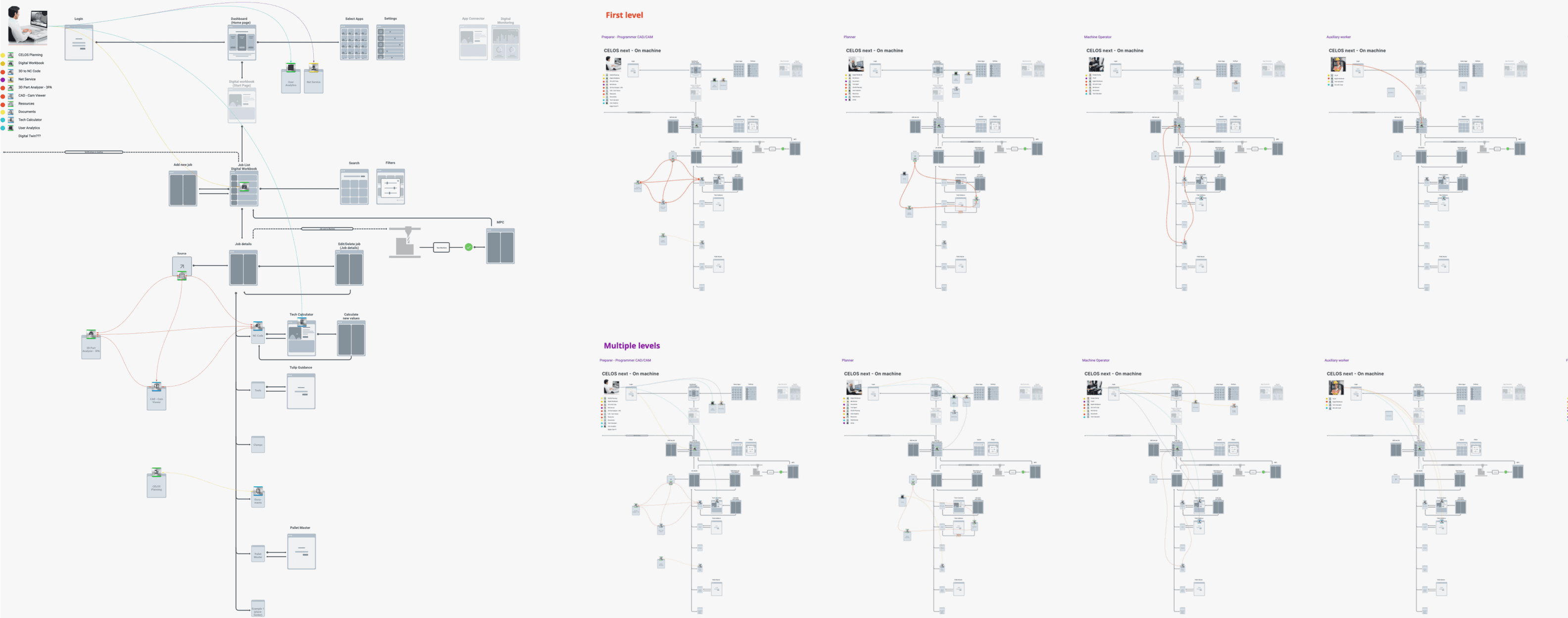
The Information Architecture (IA) is a crucial component in UX/UI design, serving as the underlying structure for the User Interface (UI). IA is documented through the use of diagrams, tables, and other visual aids, excluding wireframes, prototypes, and comprehensive layouts. Despite its invisibility in the UI, the IA greatly affects the User Experience (UX) by providing a clear, intuitive flow of information and ensuring content alignment with user needs and expectations. A well-designed IA enhances the overall UX by fostering a sense of coherence and satisfaction.
Please select filter for more content.
The CELOS platform encompasses a suite of applications that have been organized into five distinct categories: Planning, Preparation, Production, Monitoring, and Service. To ensure seamless information flow and data exchange between the various applications, a robust Information Architecture (IA) has been developed. This IA takes into account the differing needs of the target personas and prioritizes their usage of key apps by creating a concept of essential applications for each persona. This approach optimizes the user experience by ensuring that each persona has easy access to the most relevant applications and the information they require.
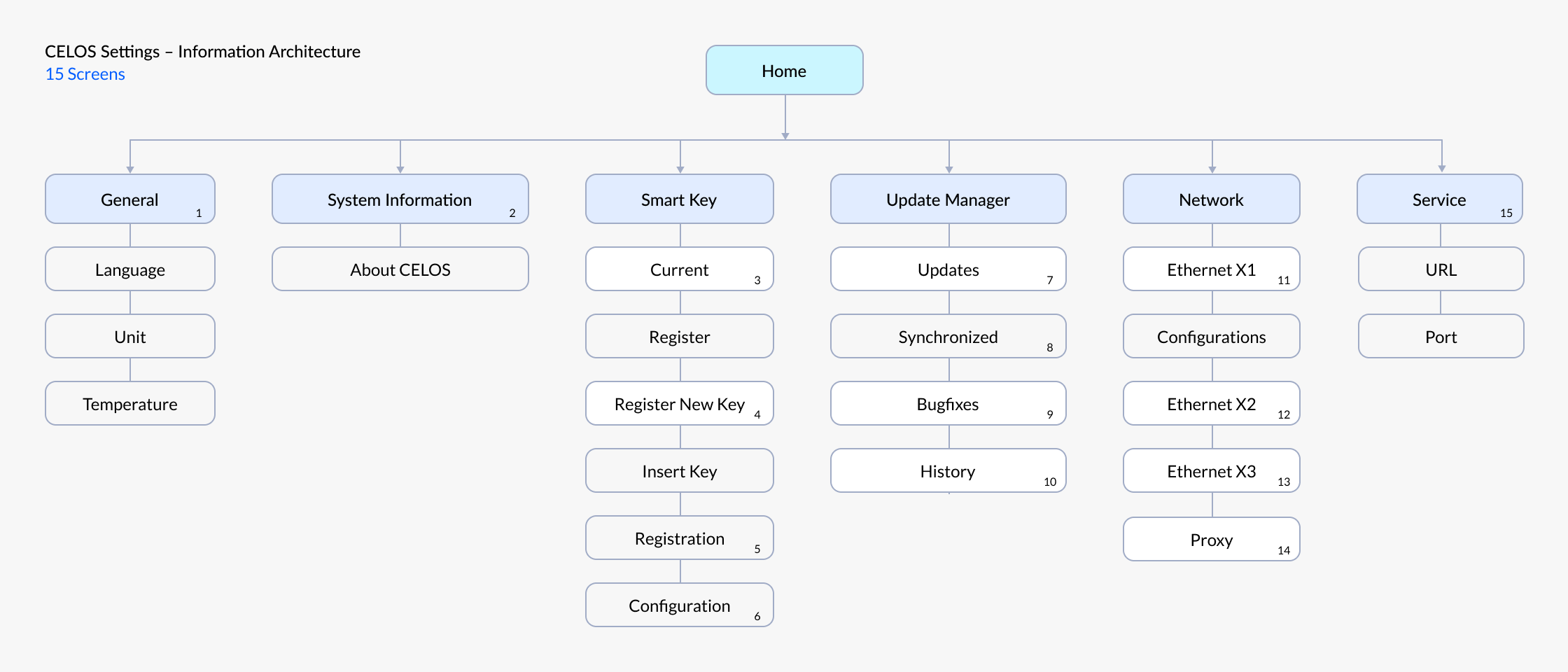
The CELOS platform encompasses a suite of applications that have been organized into five distinct categories: Planning, Preparation, Production, Monitoring, and Service. To ensure seamless information flow and data exchange between the various applications, a robust Information Architecture (IA) has been developed. This IA takes into account the differing needs of the target personas and prioritizes their usage of key apps by creating a concept of essential applications for each persona. This approach optimizes the user experience by ensuring that each persona has easy access to the most relevant applications and the information they require.
.webp)
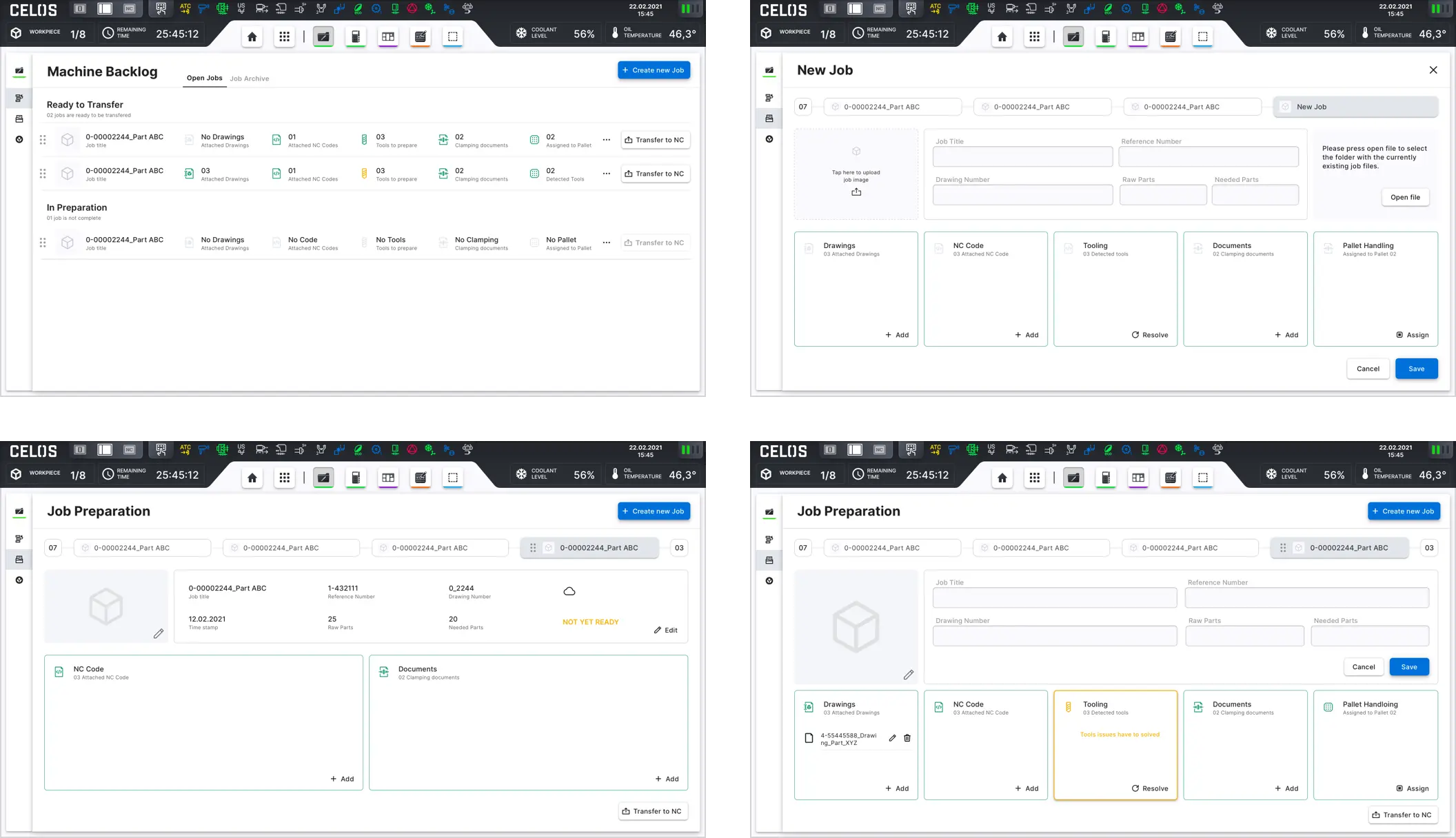
The design process begins with step 3, where the solution to the problem is created. Wireframing is used to provide an overview of the page structure, layout, IA, user flow, functionality, and behaviors. This stage helps to align expectations among stakeholders before the developers start coding the interface. Wireframes are created in low, mid, or high-fidelity based on feedback from PO's for specific applications.
Please select filter for more content.
I create low-fidelity wireframes as the starting point for the design process. These basic visual representations are raw in nature and serve to initiate discussions, define navigation layout, and map user flow. They are also ideal for evaluating multiple product concepts and making quick decisions.
In one instance, I created low-fidelity wireframes for a tool management system application with four types of content: Pots, Tools, Groups, Tool Model, and various features, each with a different focus and emphasis. The view can be easily switched between showing Turret or Magazine assigned items through a segmented toggle control on the command bar's right side. I also created wireframe documentation to support the design process.


I utilized mid-fidelity wireframes in my project. They are the most widely used of the three levels and feature a more precise representation of the layout. Though avoiding unnecessary elements like images or typography, mid-fidelity wireframes give greater attention to specific components and clearly distinguish features. I used different text weights to differentiate headings from body content for clarity.
.webp)
I create high-fidelity wireframes that feature pixel-precise layouts. These wireframes can include actual images and written content, adding more detail and making them ideal for exploring and documenting complex concepts such as menu systems and interactive maps. High-fidelity wireframes provide a more complete and accurate representation of the final product, and are therefore particularly useful for gaining stakeholder approval and communicating design decisions.
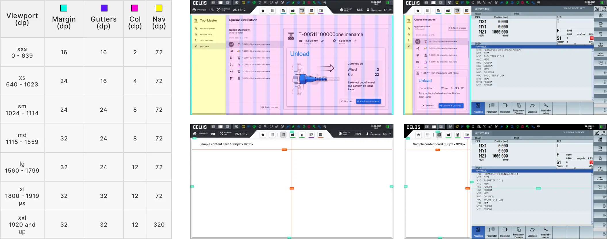
I ensure consistency across layouts in CELOS by implementing a responsive layout grid. This grid adjusts dynamically to accommodate changes in screen size and orientation, providing a seamless user experience across different devices. The responsive layout grid is a critical aspect of design, as it helps to maintain the overall look and feel of the interface and ensures that content is properly presented and accessible on all devices.
Please select filter for more content.
I designed CELOS' responsive layout grid with four components: Columns, Gutters, Margins, and Sidebar.
The columns are where the content is placed, with column width specified in percentages to adjust to any screen size.
The gutters between columns divide the content, with fixed values for gutter width at each breakpoint range.
The margin, between the content and the screen's edges, uses a fixed or scaling value and adjusts to fit the screen at different breakpoints.
The sidebar, on the left side of the screen, contains the app's navigation and its width adjusts at different breakpoints for better screen fit.


I implemented responsive layout design in the CELOS project to ensure optimal viewing experience on various screens and devices. The layout adapts to different screen sizes and orientations through defined breakpoint ranges. The responsive grid used in the design consists of 2-column, 4-column, 8-column, and 12-column systems, with each breakpoint range determining the number of columns and specifying the recommended margins, gutters, and sidebar widths for each screen size.

I establish the interface structure through the use of layout regions that consist of functional elements and components. The creation of these regions can also be achieved through the utilization of smaller containers. The full-screen layout for large screens is comprised of three key components: the app bar, the navigation sidebar, and the primary body.

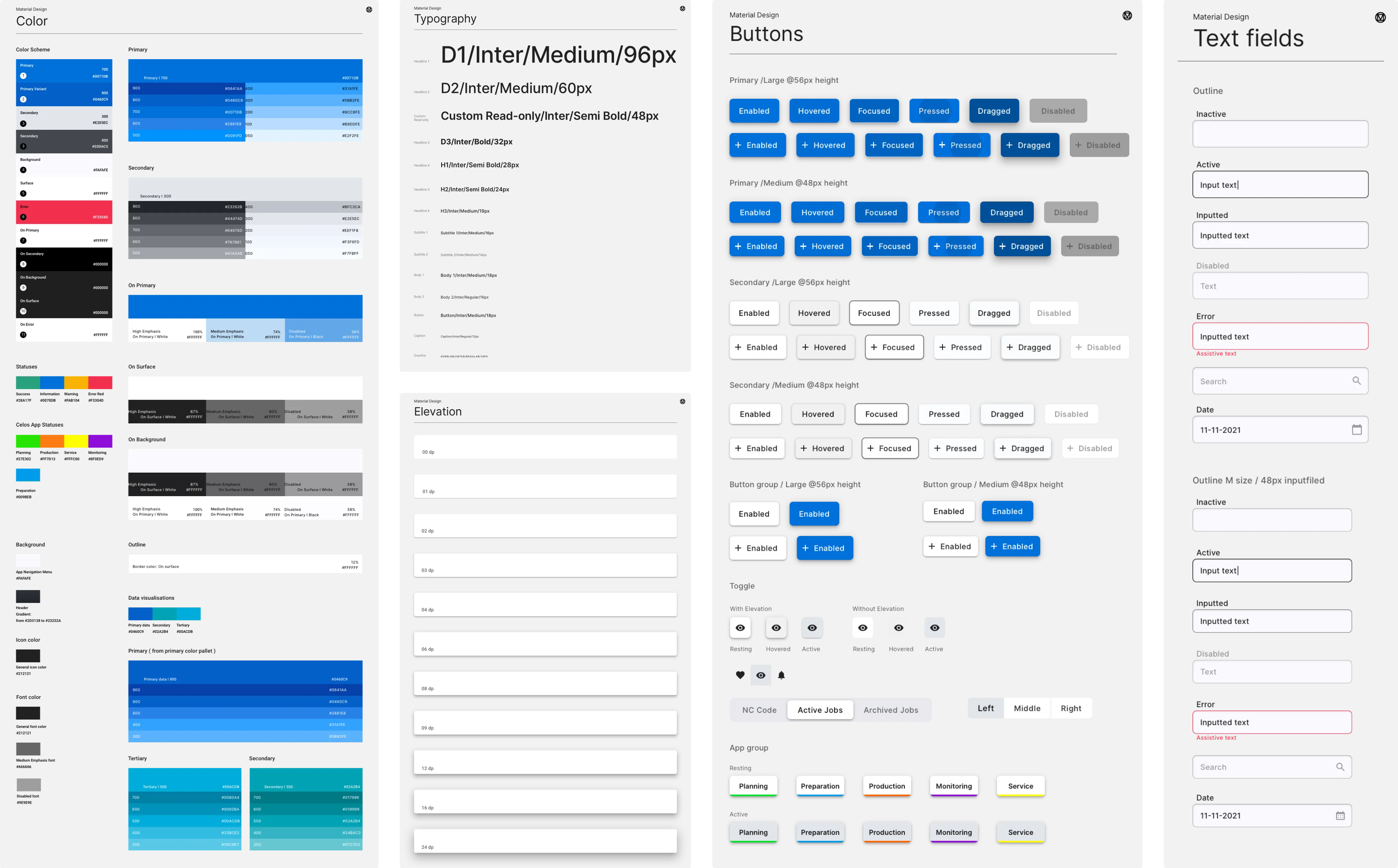
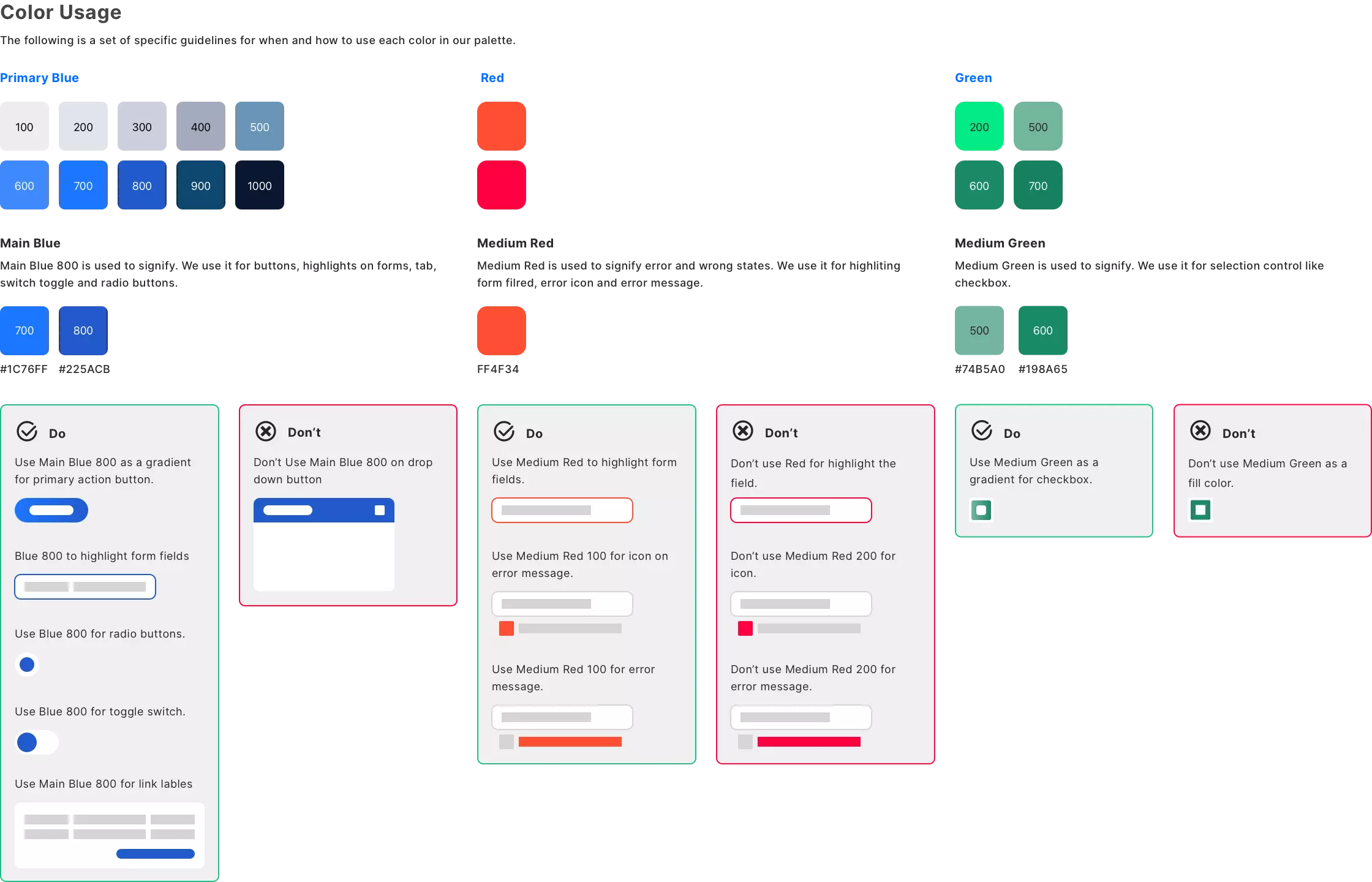
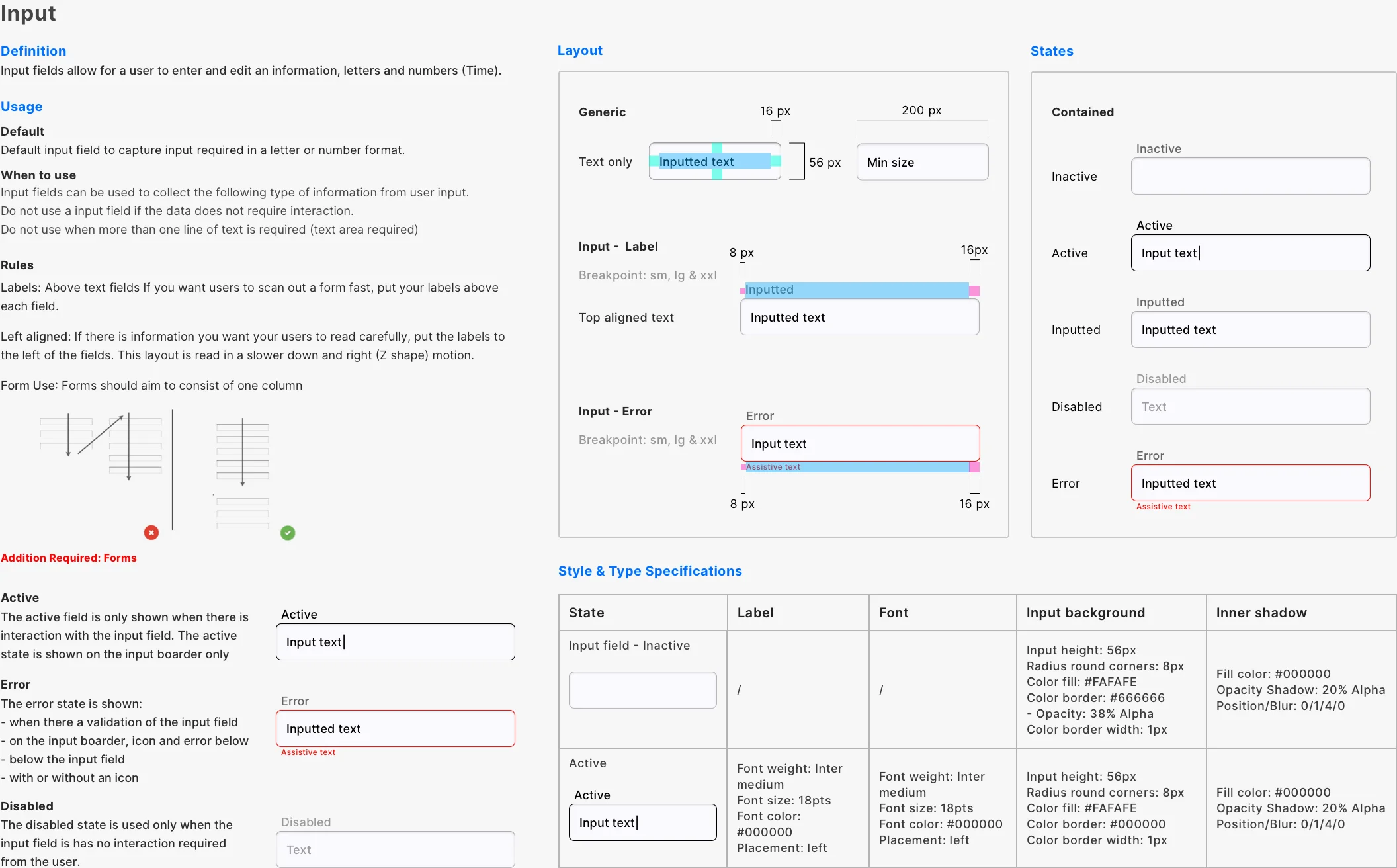
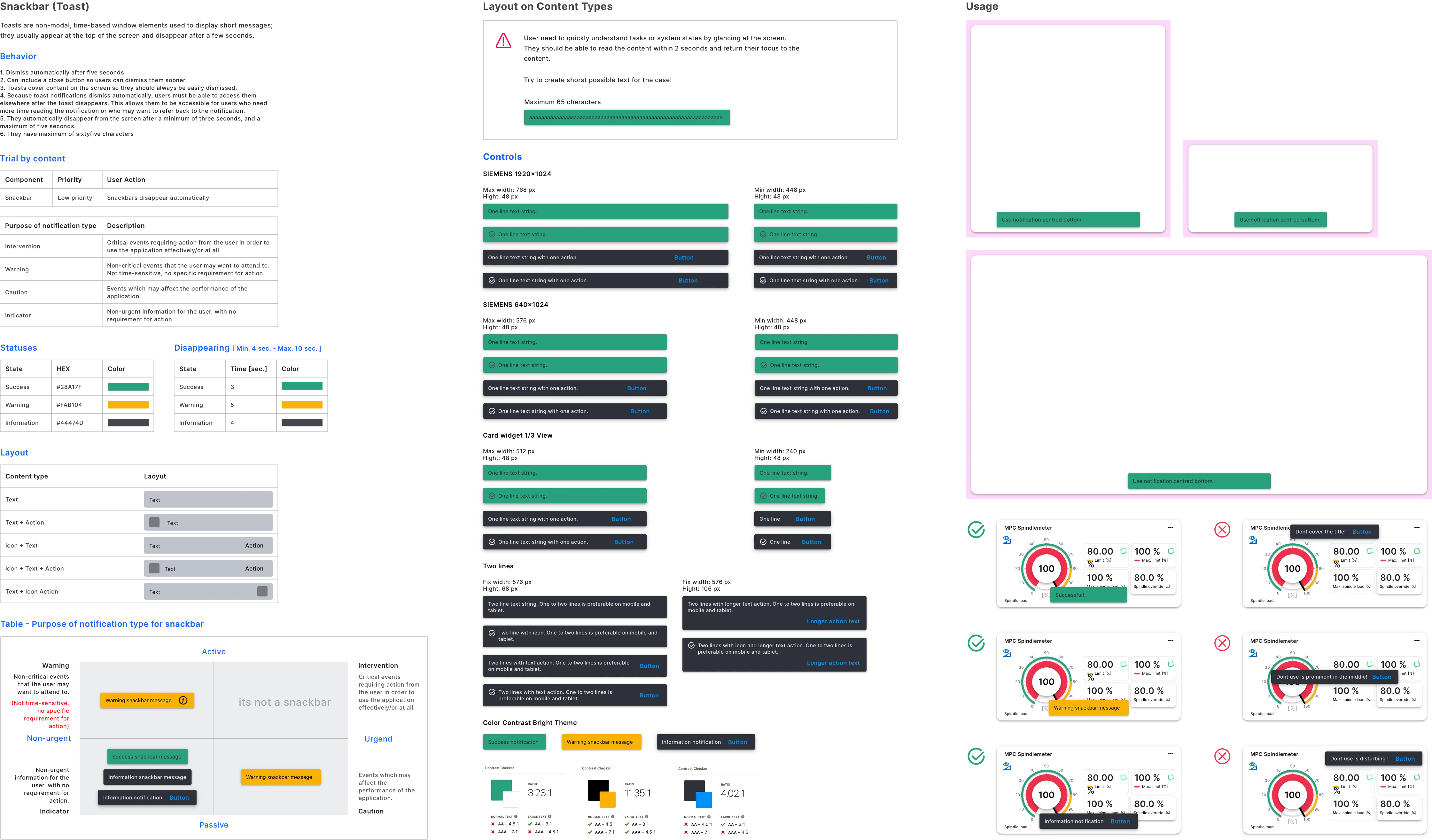
To elevate UX design standards, ensure consistency, and streamline the design process across products, CELOS introduced a design system, that incorporates principles from Material Design and utilizes Angular Material as the technological foundation.
Please select filter for more content.
As a UX Designer, I was responsible for the development and implementation of SOFIA, the design system for DMG MORI. Based on Material Design and Angular Material, SOFIA offers an online platform for accessing comprehensive design resources, including components, interactions, documentation, design guidelines, icon libraries, principles, and user experience guidelines. By ensuring consistency and efficiency in product design, SOFIA elevates the overall quality of the user experience.
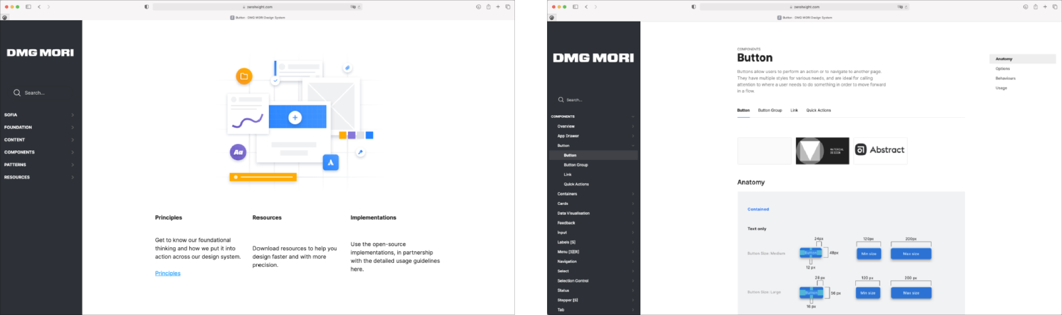
I was involved in the development of a comprehensive design system that aimed to streamline the design process, improve consistency and ensure optimal user experience across various touchpoints. This design system was based on principles of standardization and modularity, offering a shared visual language and style across different pages and channels. By reducing redundant design elements and promoting a unified approach, the design system significantly enhanced the efficiency and productivity of the design team.
.webp)
I conceptualized and developed a comprehensive design system to establish a uniform visual language and aesthetic throughout multiple products. To maintain consistency and streamline the design process for product teams and designers, I created a comprehensive set of design standards and interactions, ensuring the seamless implementation of a consistent design philosophy across multiple design teams and developers.
I facilitated the creation of digital prototypes to validate and refine design concepts, as part of a comprehensive design process. High-fidelity prototypes, including screen flow, were developed to accurately simulate the finished product and evaluate user experiences, interactions, and interface usability. Through usability testing and iteration, these prototypes helped to identify and resolve user pain points, enabling effective collaboration between design, stakeholder, and engineering teams.
To efficiently validate and refine the design, I crafted high-fidelity screen flows that simulate the end product's true size and appearance. These detailed depictions provided a valuable tool for testing user interfaces, interactions, and overall user experience, allowing me to identify and address user pain points through usability testing.
.webp)