Process
I worked on four general steps to develop this large project: Requirements, Wireframe, Responsive Design, Digital Prototyping. The project involved extensive UX and UI design. Several project owners, developers, and designers were involved and the project team worked in design sprints. Three applications are shown below: Documents, Operator Workbook, and Tool Master, which represent the full scope of working method as well as the design of the user interface.
Steps
Please choose the following steps to discover the implementation of the project.
The approach for this project started with the briefing about the application, then the requirements were clarified. The features, functions, and tasks that must be completed for a project to be considered successful are referred to as project requirements (or to at least be wrapped up). Additionally, in UX workshops, the various goals that need to be achieved were defined. This gives everyone involved a clear framework within which they can work.
Please select filter for more content.
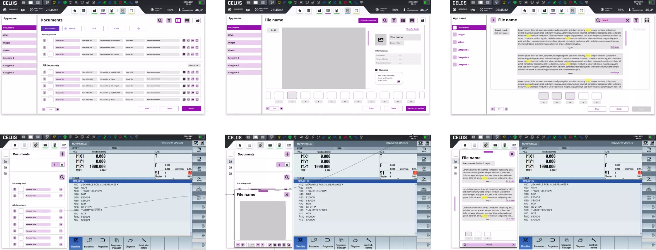
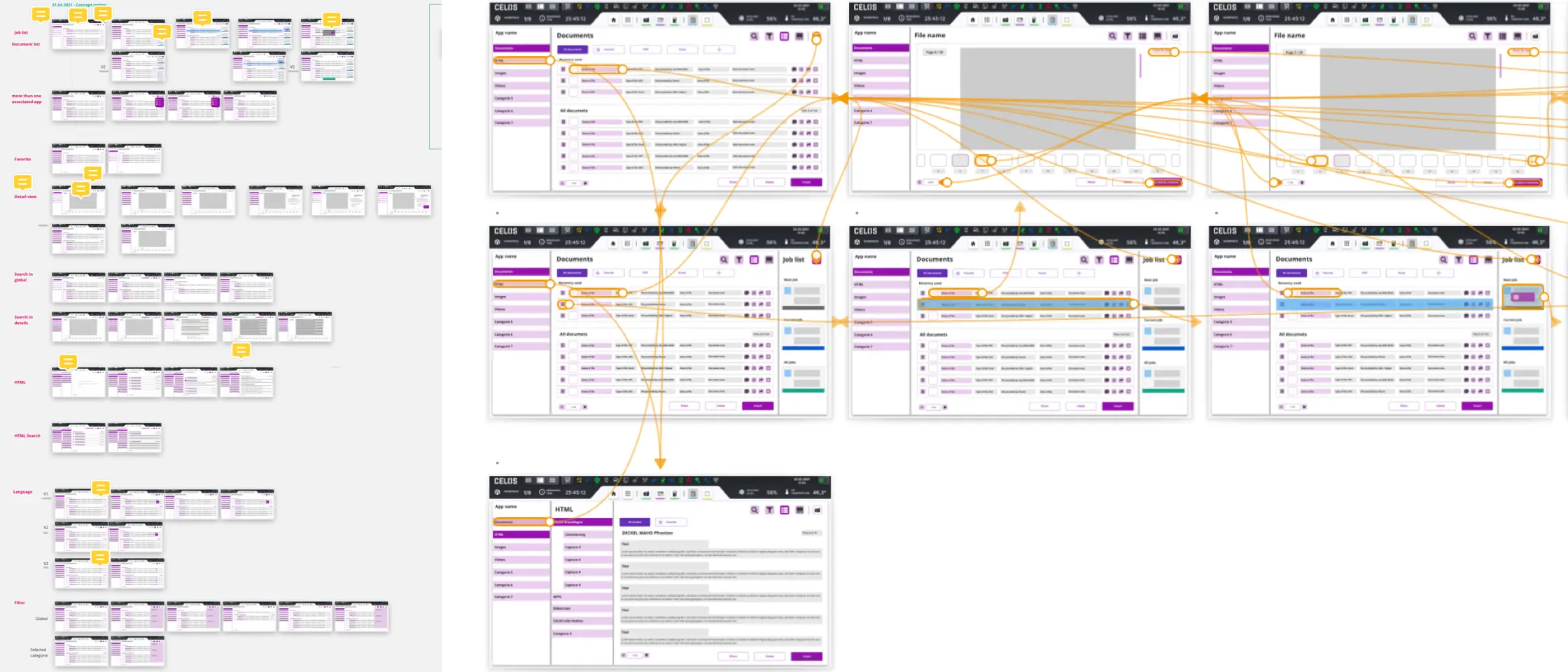
The task for the document app was to redesign and redefine it in accordance with the CELOS design system and user needs, based on the PO briefing. So, using the card sorting principle, I generated initial concepts and potential user requirements. As a result, after logging into the CELOS system, the user can access all of the files on the system, such as documents, images, and videos.
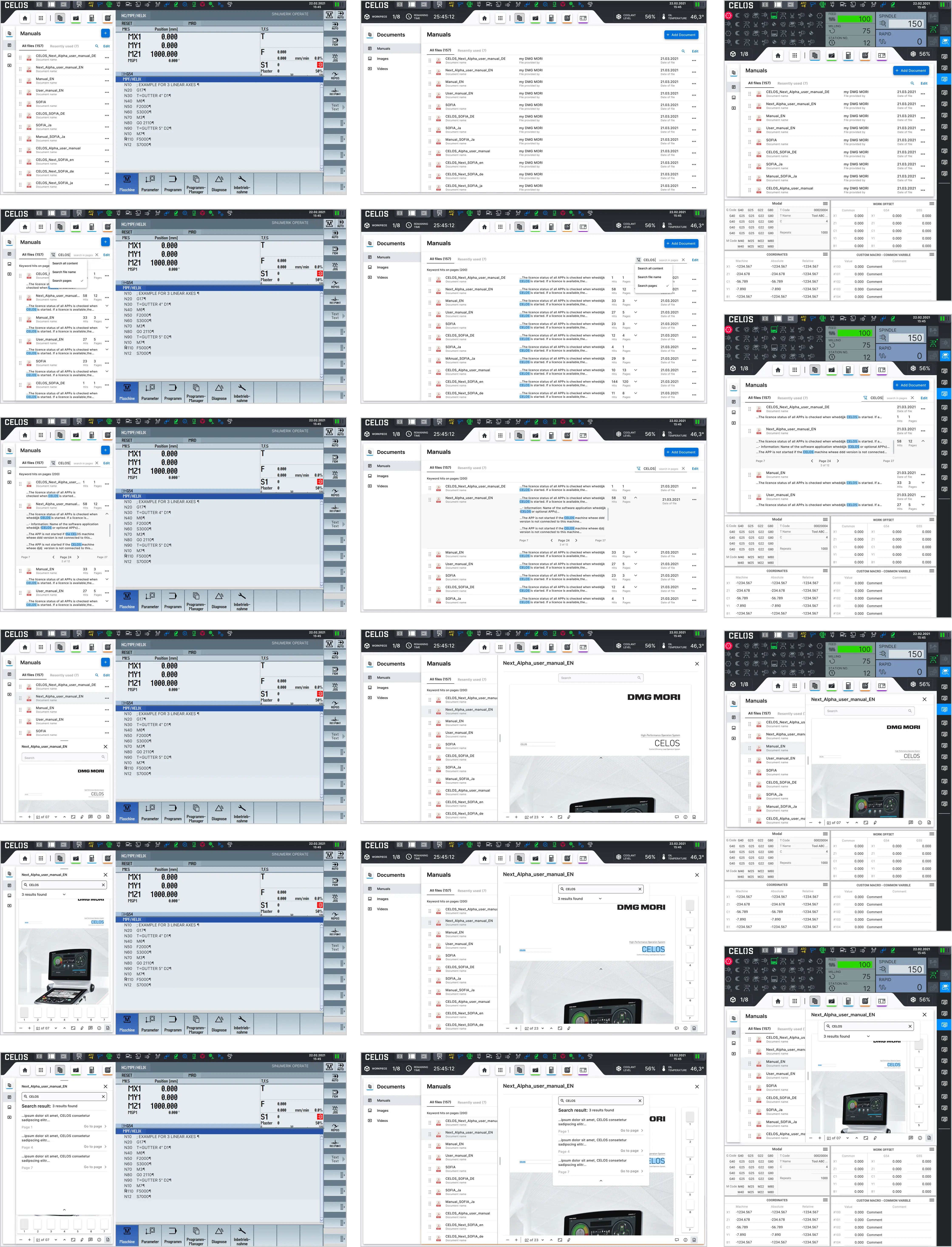
Documents App is a standard app by CELOS Apps - Digital reference tool for documents, so instantly available information reduces machine downtime. The app give Library of all machine & control manuals, storage of any customer specific documents, full text search & bookmark function for recurring reference areas.
A machine is equipped with various types of documents such as operation manual, programming manual, CELOS manual, circuit/ladder diagrams, maintenance manual, optional feature manual etc. Those documents should be imported at commissioning process. Users read documents to understand functionality of the machine or trouble shoot issues.
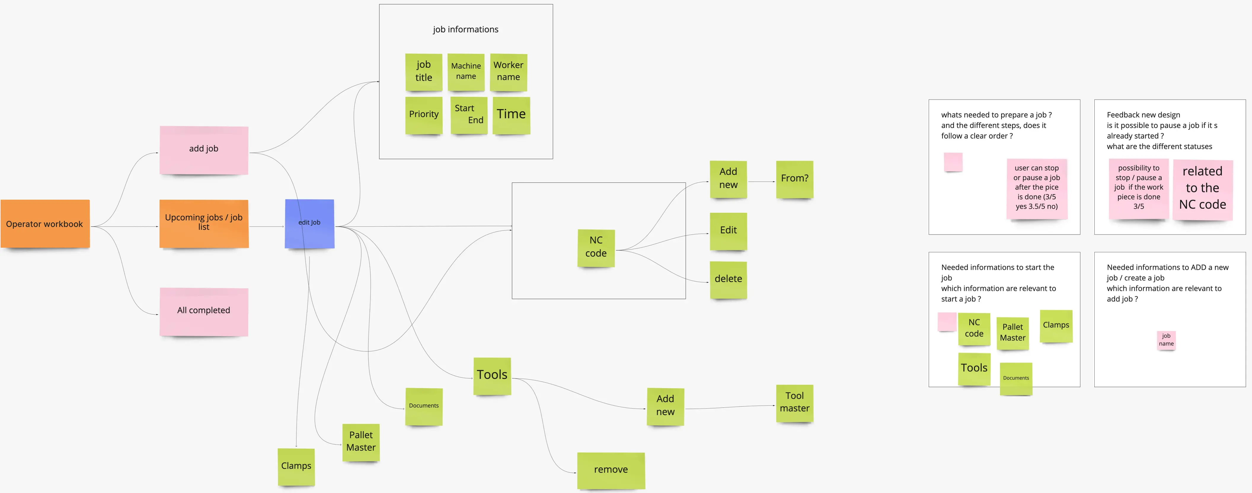
Based on the PO briefing, the task for the Operation Workbook app was to redesign and redefine it in accordance with the CELOS design system and user needs. Using the UX Methods, I created initial concepts, potential user requirements, information architecture, site flow, and user flow.
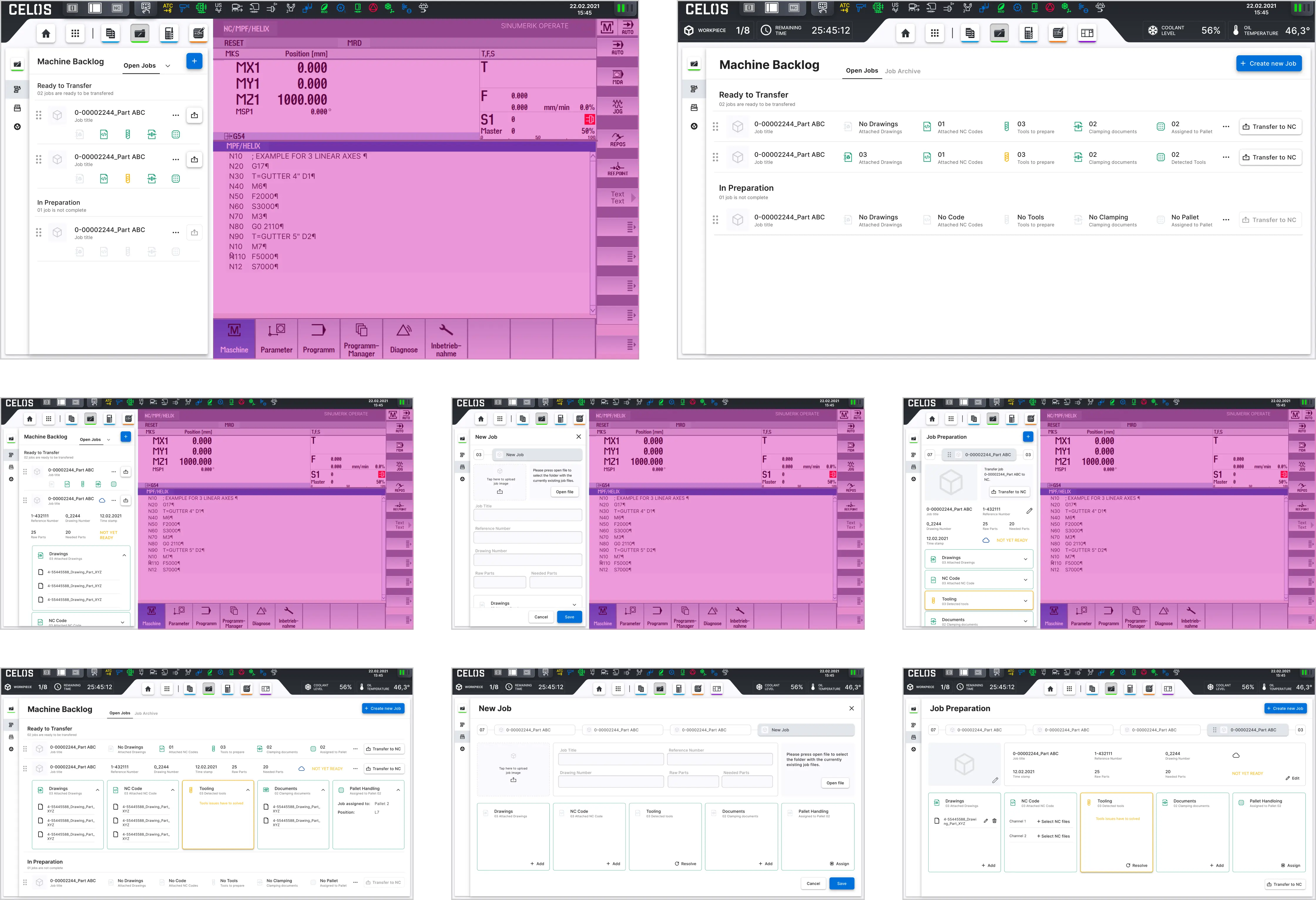
With the standard CELOS app Operator Workbook, the user (machine operator) can operating the App from any CELOS PC workstation, automatic importing and systematic management and preparation of jobs. This optimizes machine utilization and setup times. The app allows that jobs can be imported directly into CELOS. The customer no longer has to manually transfer his jobs from the MES system into CELOS, but can set up an automatic transfer that enables data exchange from his MES into CELOS. The prerequisite for the direct import is that the customer's MES system provides the jobs in the job-specific .cba data format and stores them on the specified directory within CELOS.

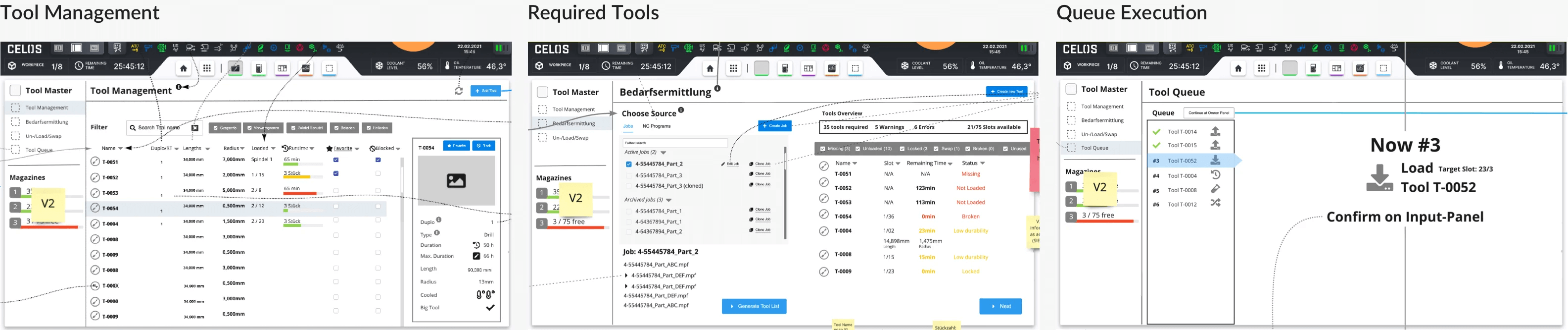
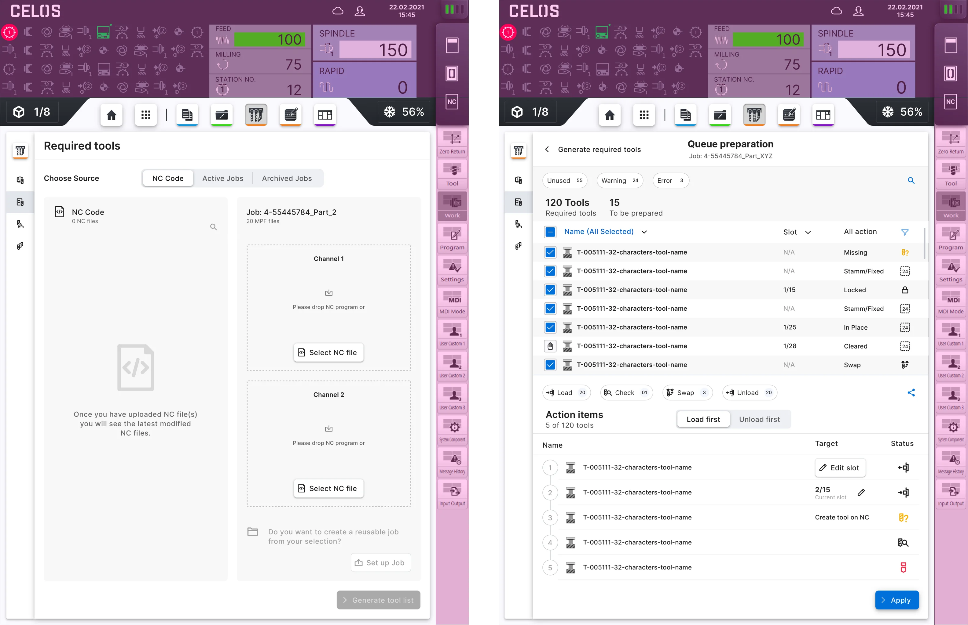
The POs presented the basic functions and user needs for Tool Master, a completely new app. So the task was to design and develop the app. The concept, information architecture, and site flow of the application were further developed in UX workshops.
Tool Master is a production group app that assists the machine operator during the manufacturing process. It includes the following features: the creation and management of digital tools; the setting of tool parameters; the recording of presetting data; the analysis of recorded tool and process data; improved handling of physical tools (loading and unloading); the identification and adjustment of digital and physical tools; tool change list for anticipated, optimized retooling; the display of all tools required for a job; automatic loading list generation; generation of an unloading list through the automatic detection of all tools not required for subsequent jobs.
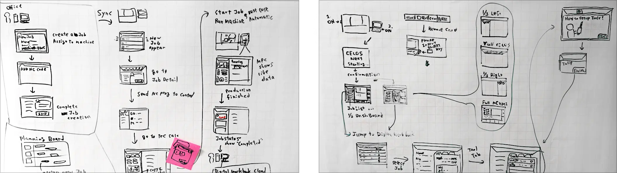
The wireframe step is where the actual creation of the solution identified in the first step begins. This ensures that the page structure, layout, information architecture, user flow, functionality, and intended behaviors are all clearly visible. It also allows all stakeholders to agree on where the information should be placed before the developers begin programming the interface.
I created three conceptual interactive drafts for each product. After evaluating the variants, the most optimal solution according to the requirements was chosen and implemented.
Please select filter for more content.
Responsive wireframes were made in accordance with the CELOS system's requirements, which call for the app to be usable on a variety of screens, devices, and orientations. The wireframe also included user interaction and flow.
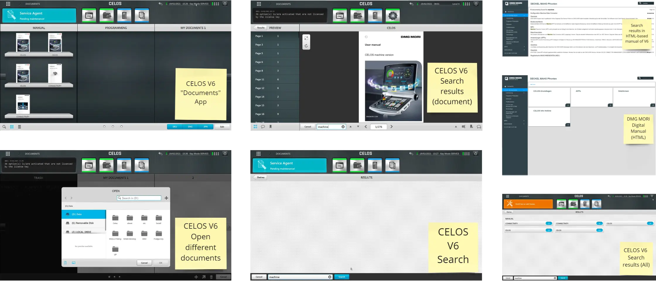
The Documents App display the documents list and documents search, adding a document via filled action button, editing a documents via frameless button, searching in files or in pages and showing the results, detailed view of the document with several actions like share, comment, pagination, expand and collapsed, zoom in and out, full screen, mark.
The chosen wireframe also has the benefit of requiring the user to exert 50% less effort to find important information.
The CELOS system required that the app be usable on a variety of screens, devices, and orientations, so responsive wireframes were created. User interaction and flow were also included in the wireframe.
With Operator Workbook, jobs can be imported directly into CELOS. The customer no longer has to manually transfer his jobs from the MES system into CELOS, but can set up an automatic transfer that enables data exchange from his MES into CELOS. The prerequisite for the direct import is that the customer's MES system provides the jobs in the job-specific .cba data format and stores them on the specified directory within CELOS.
.png)
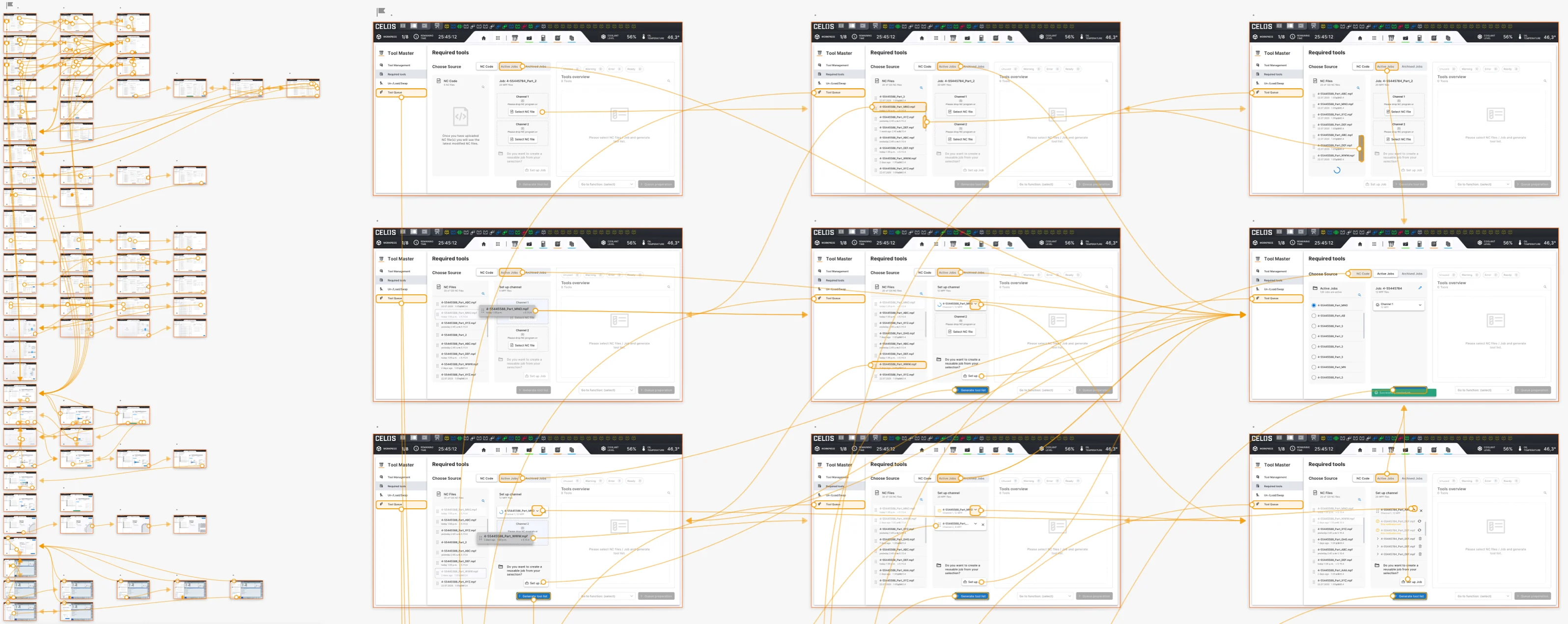
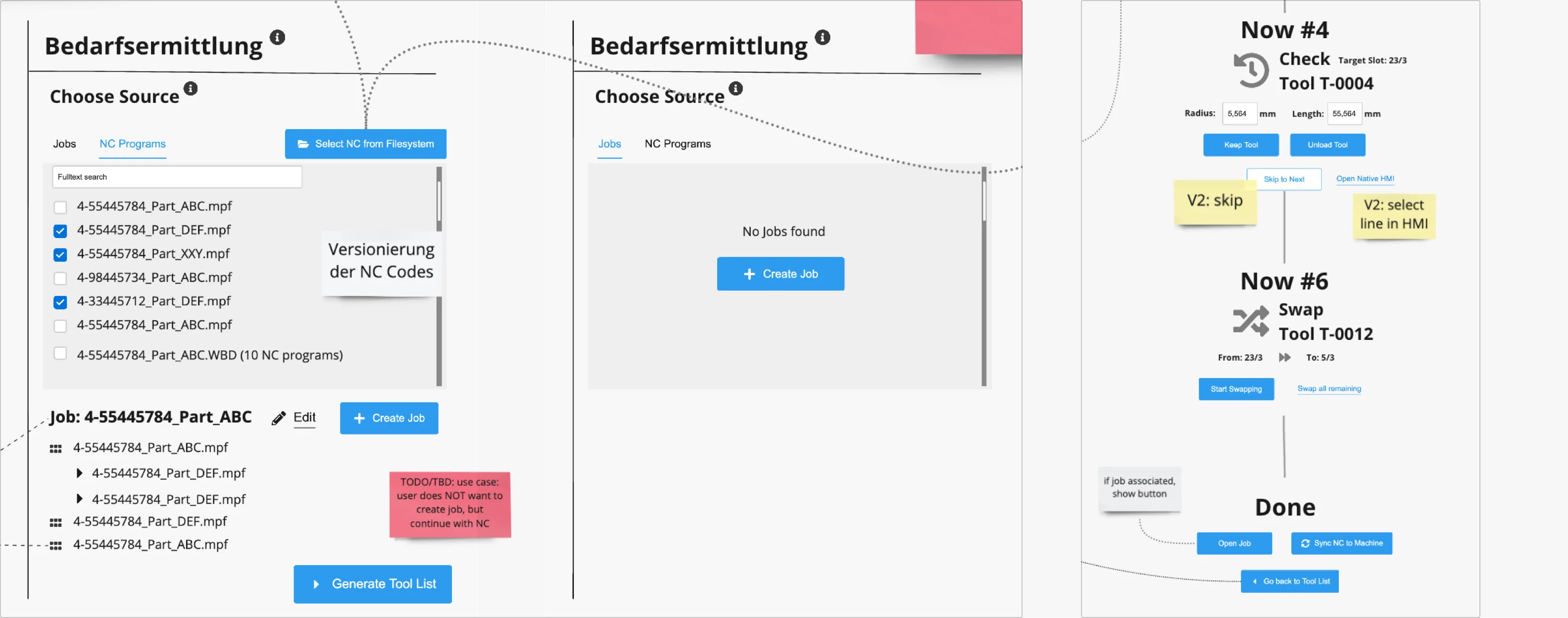
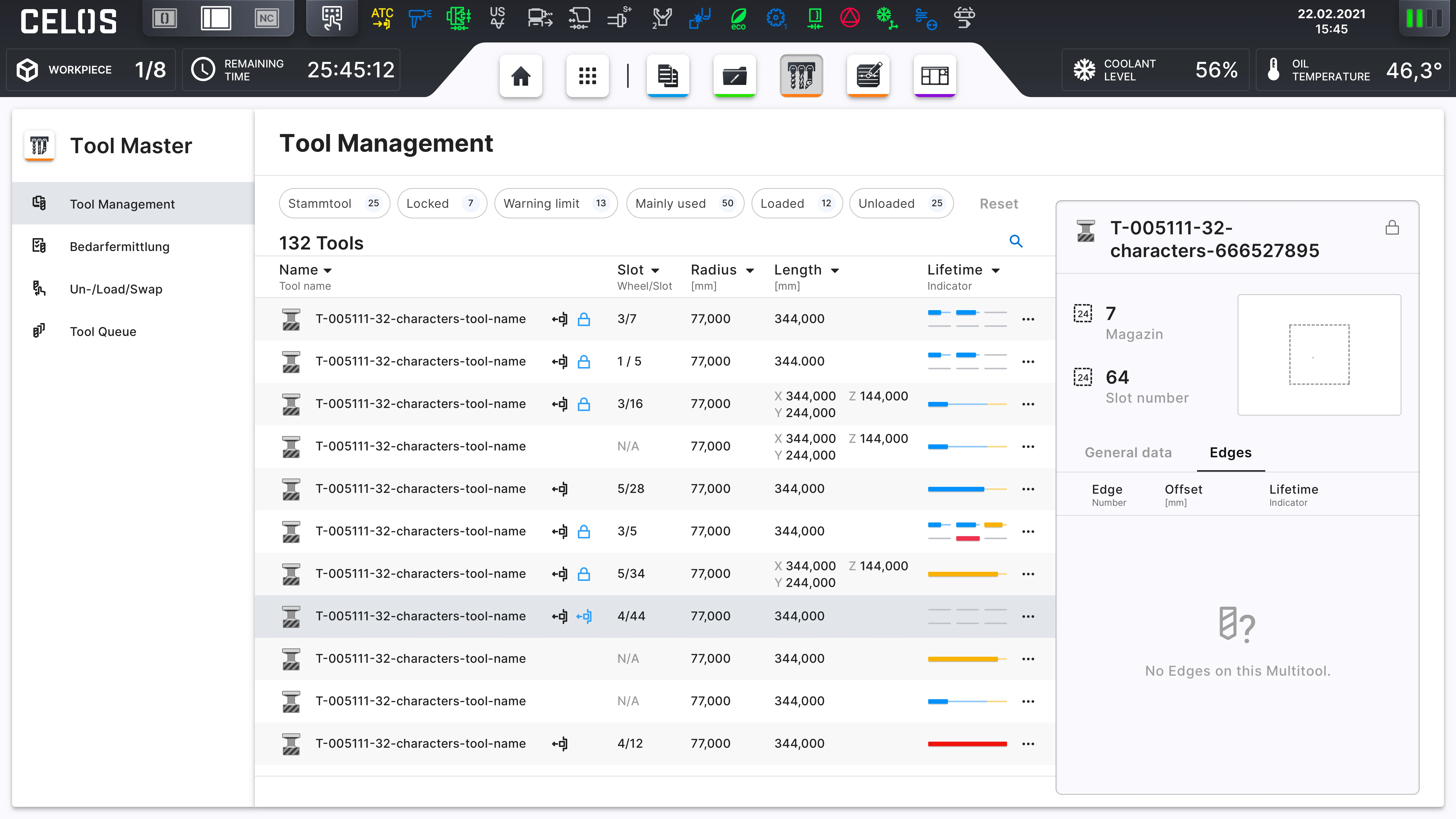
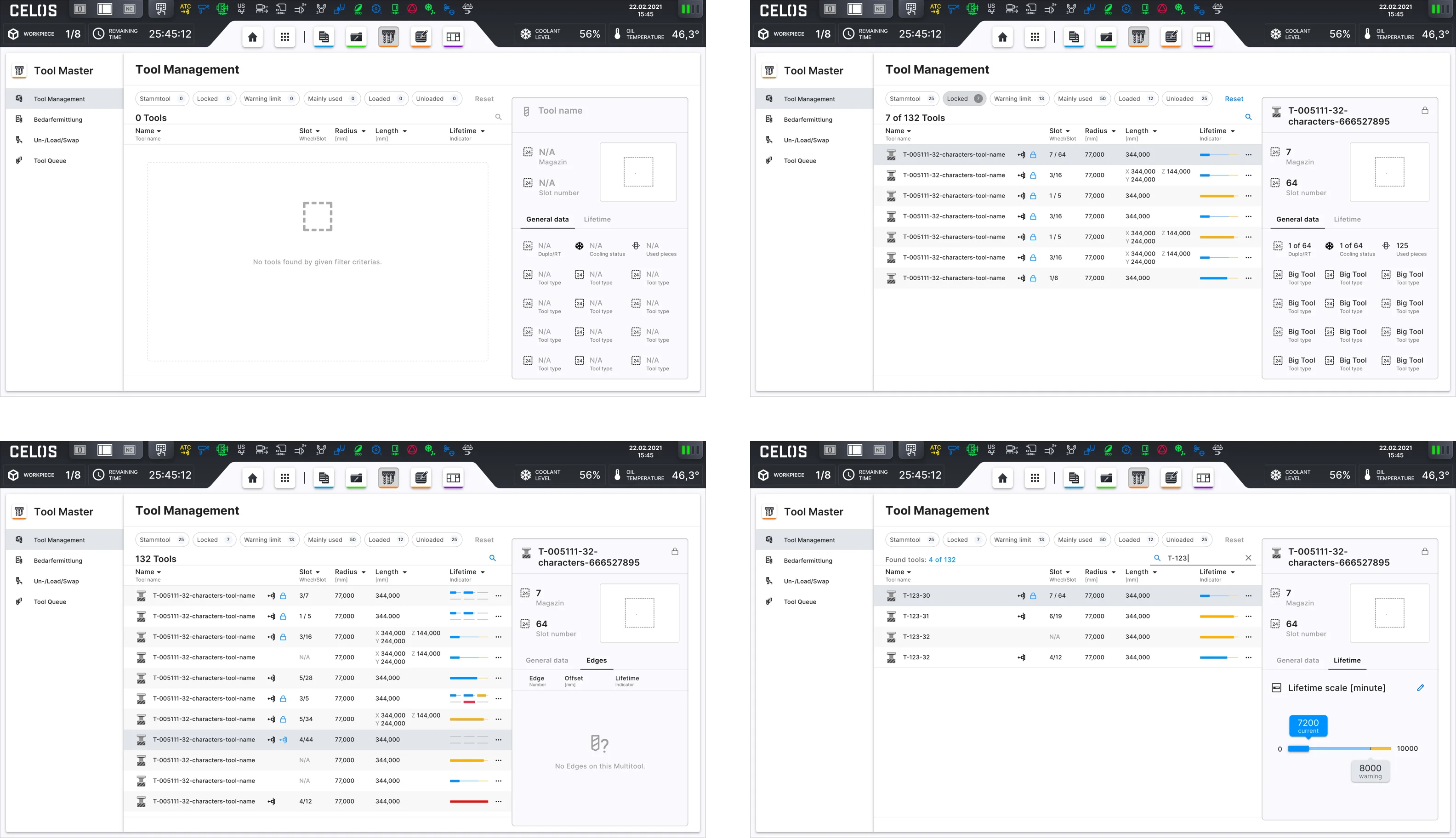
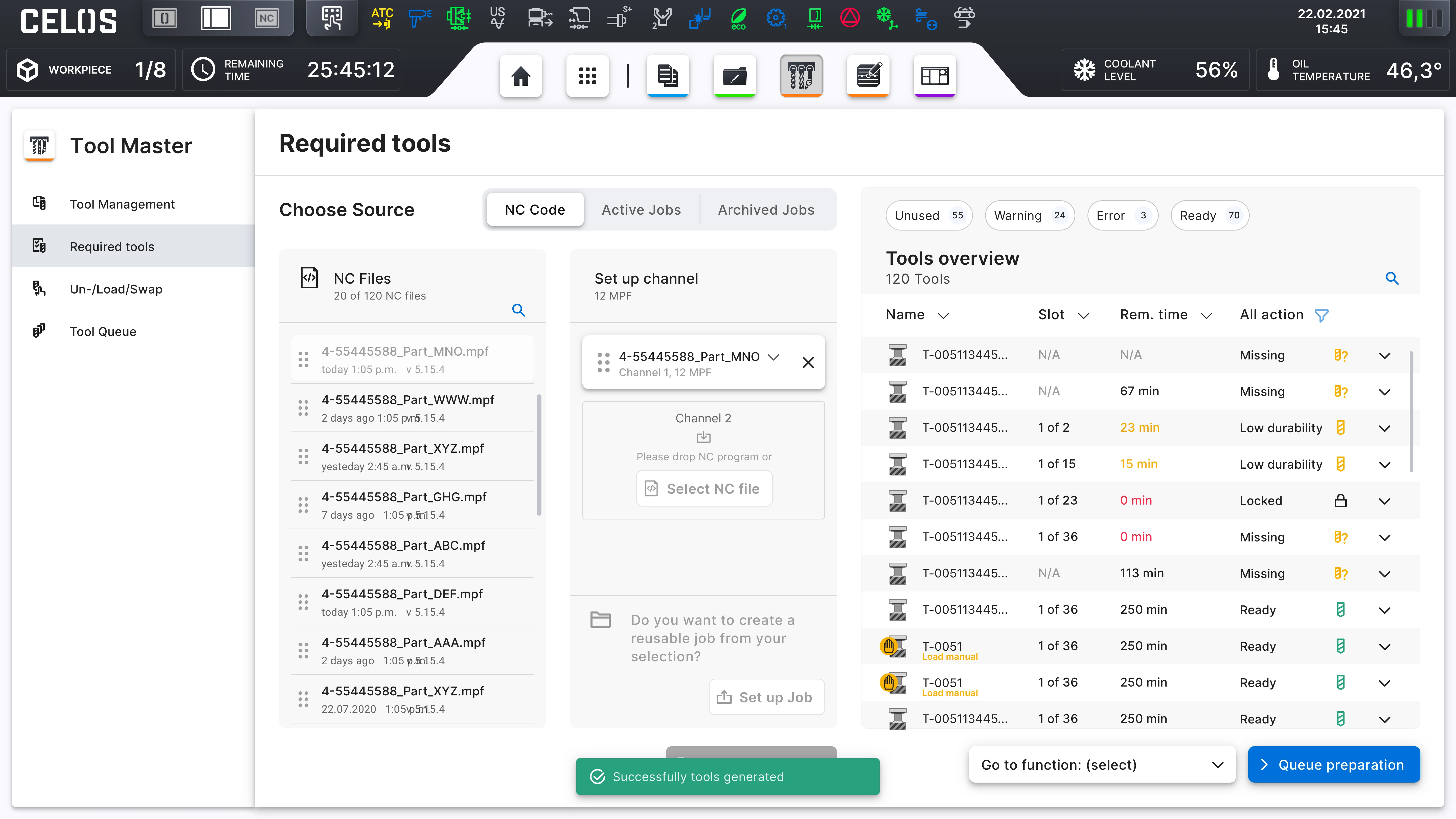
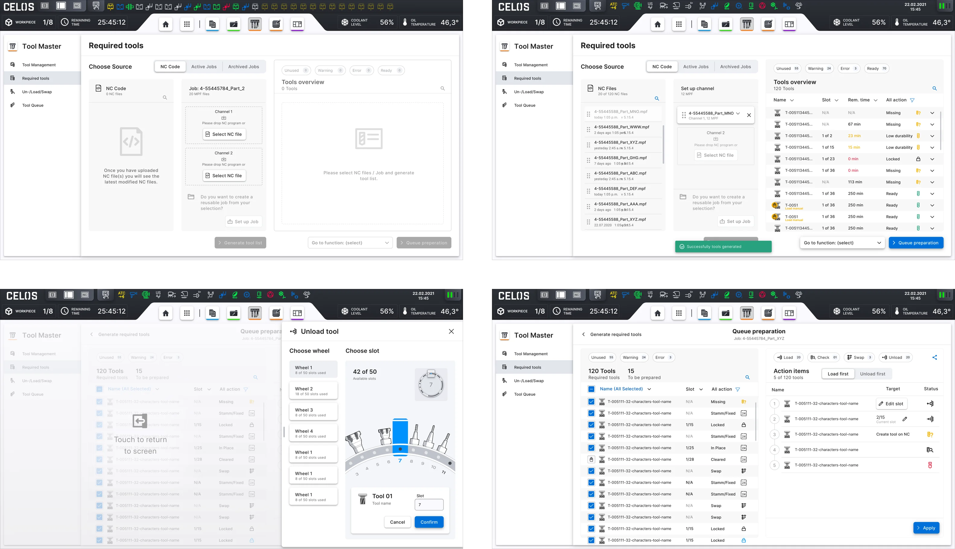
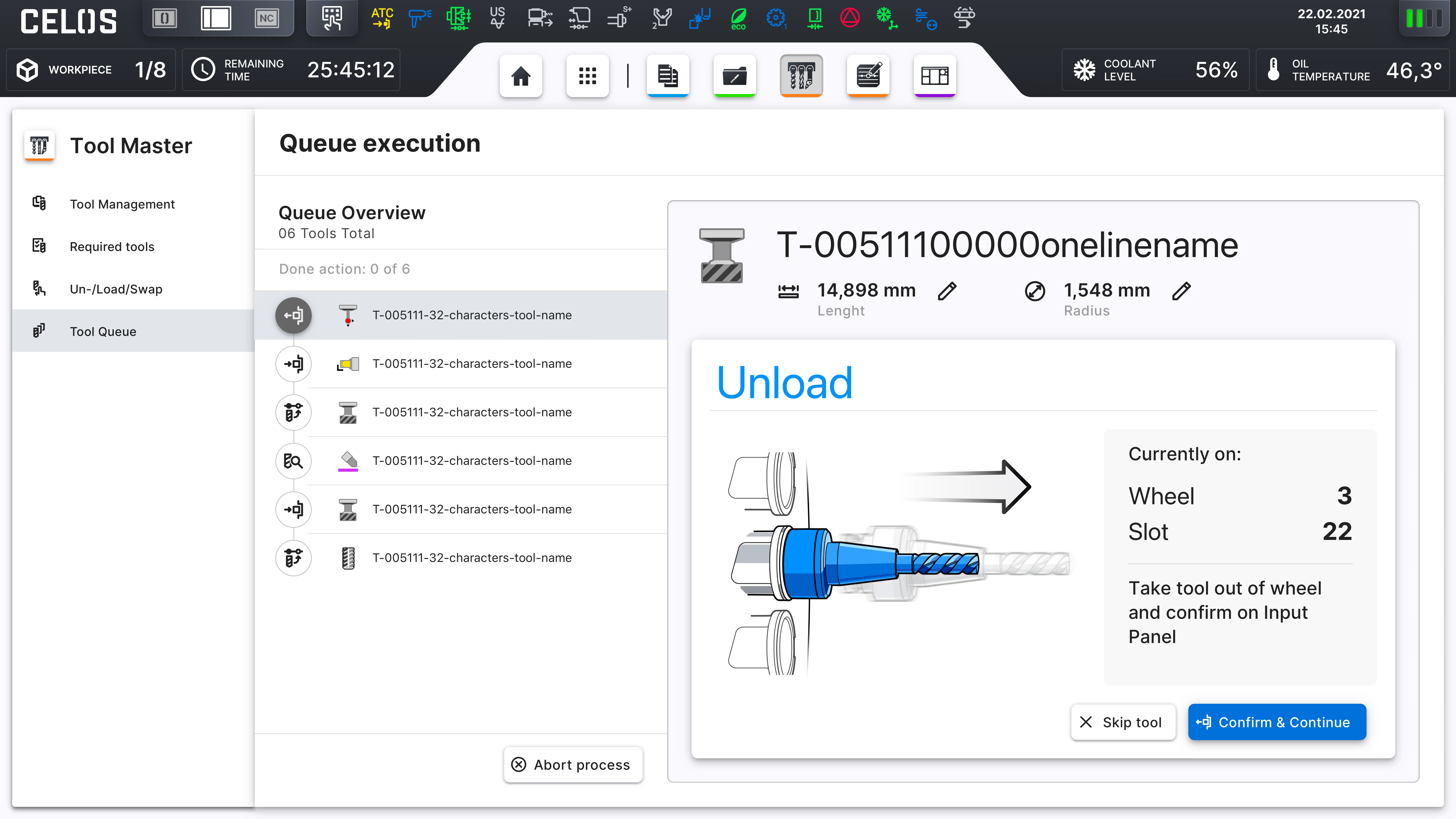
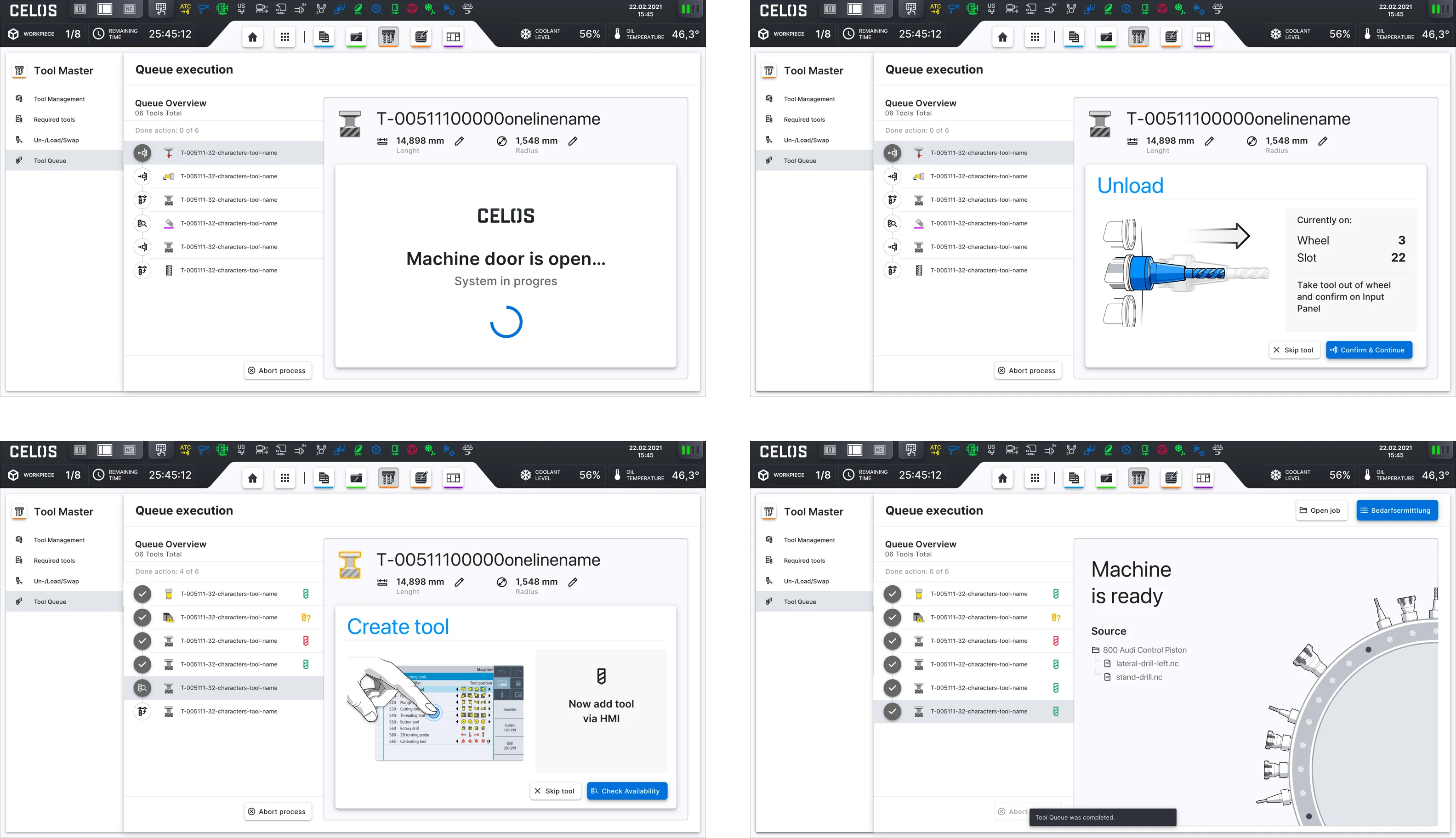
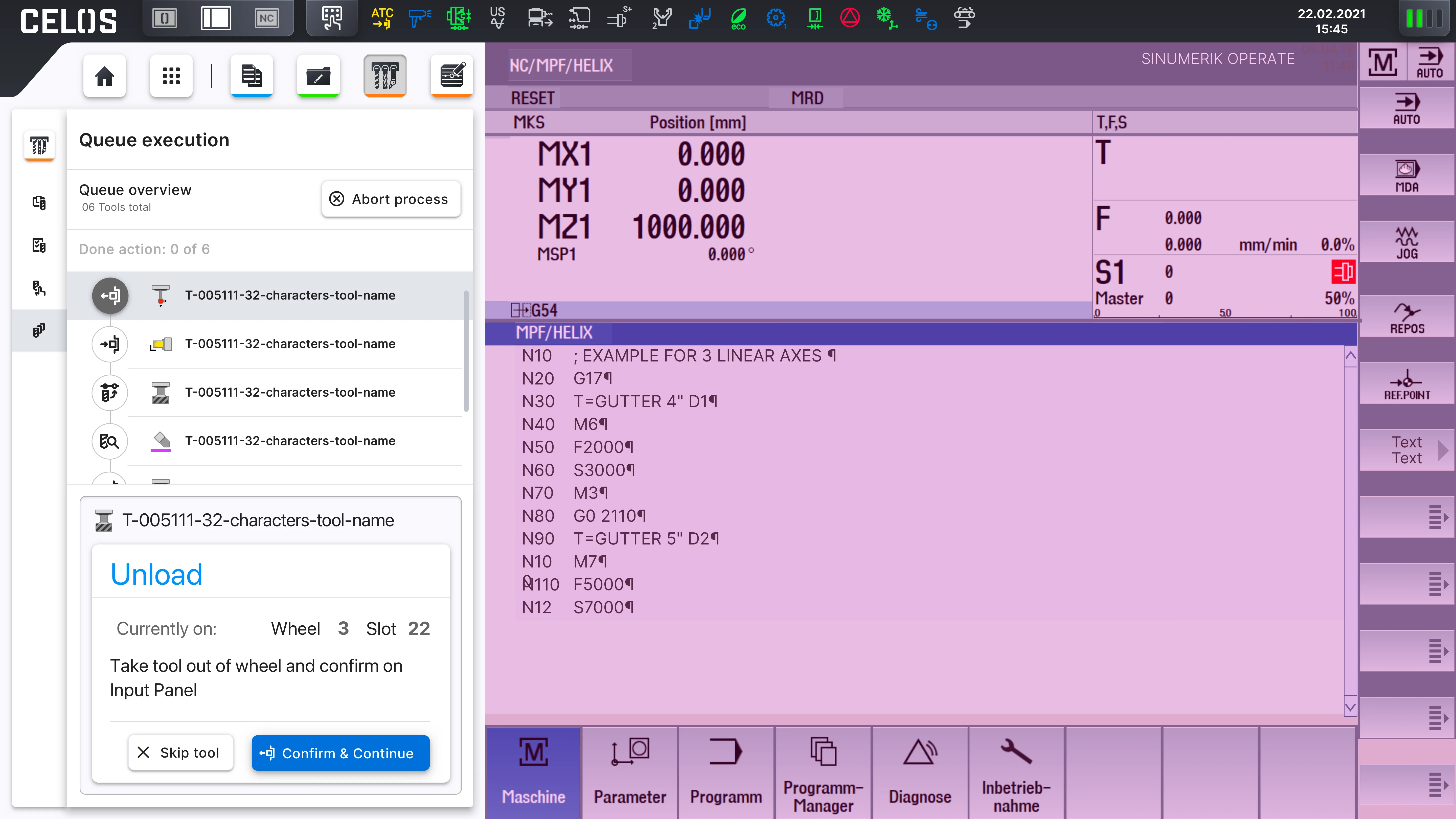
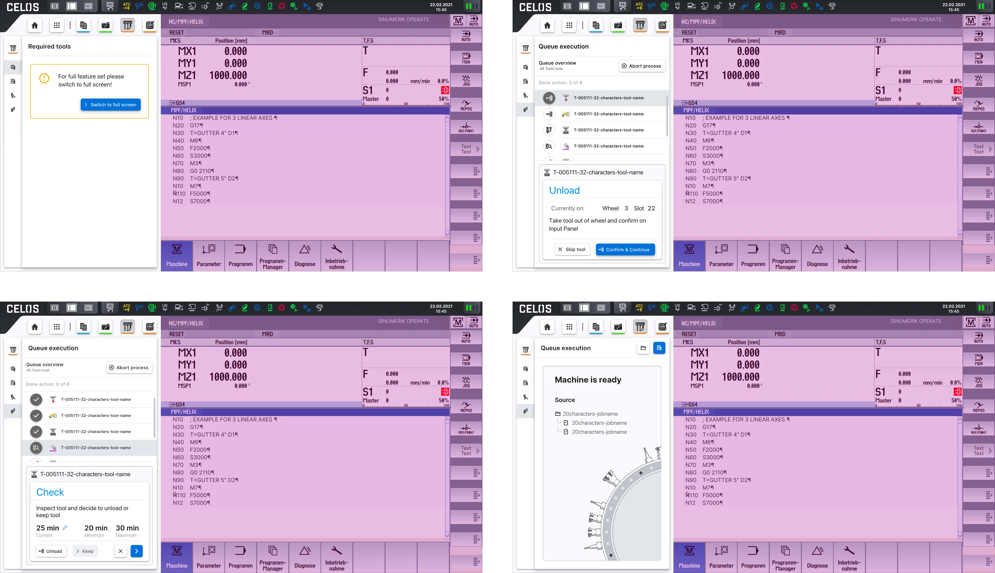
The CELOS system required that the app be usable on a variety of screens, devices, and orientations, so responsive wireframes were created. User interaction and flow were also included in the wireframe. Due to its extensiveness, the product has been split into two execution phases: phase one as MVP (minimum viable product), and phase two as an advanced implementation. So the MVP phase should be designed first. The app concist into four categories: Tool Management, Required Tools, Un-/Load/Swap, and Tool Queue.
The following features are included: Target-Actual- Comparison of the magazine occupancy for tool overview, all registered tools, a loading list with all tools required, unloading list with tools not required, assessments of the magazine configuration for subsequent orders, display of all tools, all the tool information necessary for the production process can be managed centrally, with tool data accessed by various systems at the same time, all process-related data is stored in a central tool management system, making the history of a tool transparent and fully traceable.
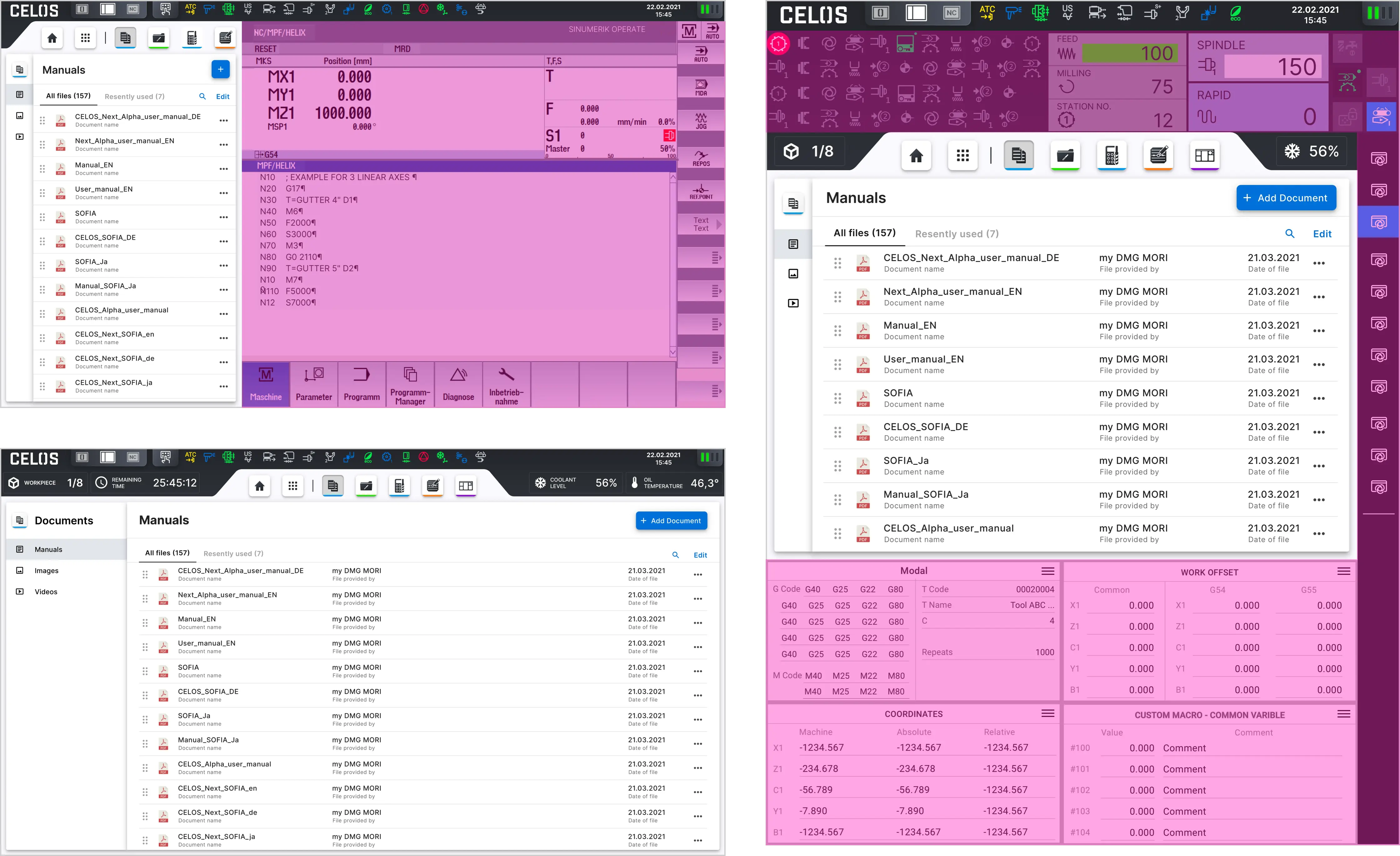
The responsive layout grid of CELOS was used to maintain design consistency for the various screen sizes of the different machine control brands. Additionally, the screens for the machine control manufacturers Siemens, Heidenhain, and MAPPS were designed using the CELOS Design System.
Please select filter for more content.
Key designs for the app are shown below. It displays the layout for the various screen sizes of the machine controls, including full and split-screen views from Siemens and a two-thirds screen view from MAPPS.
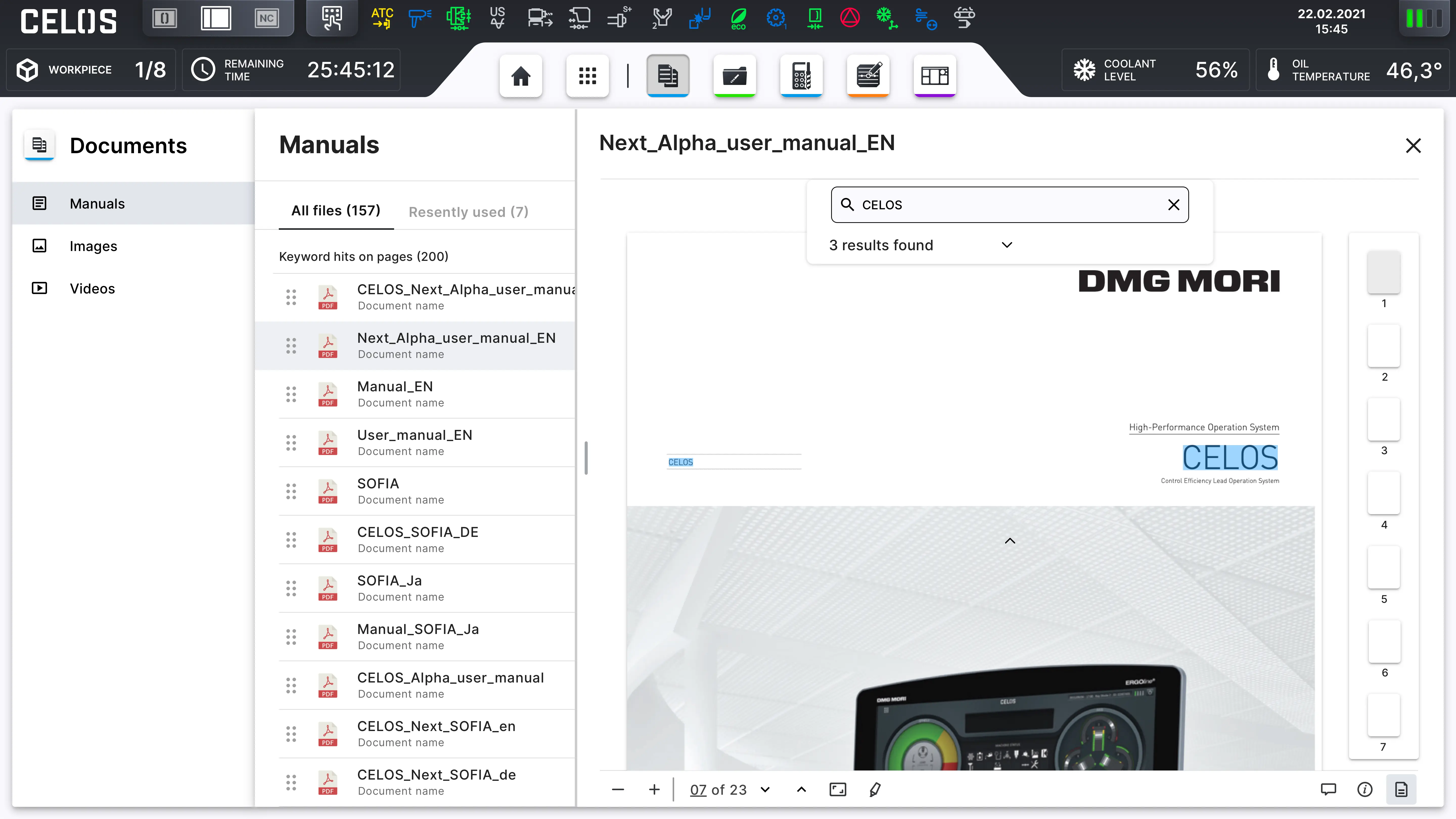
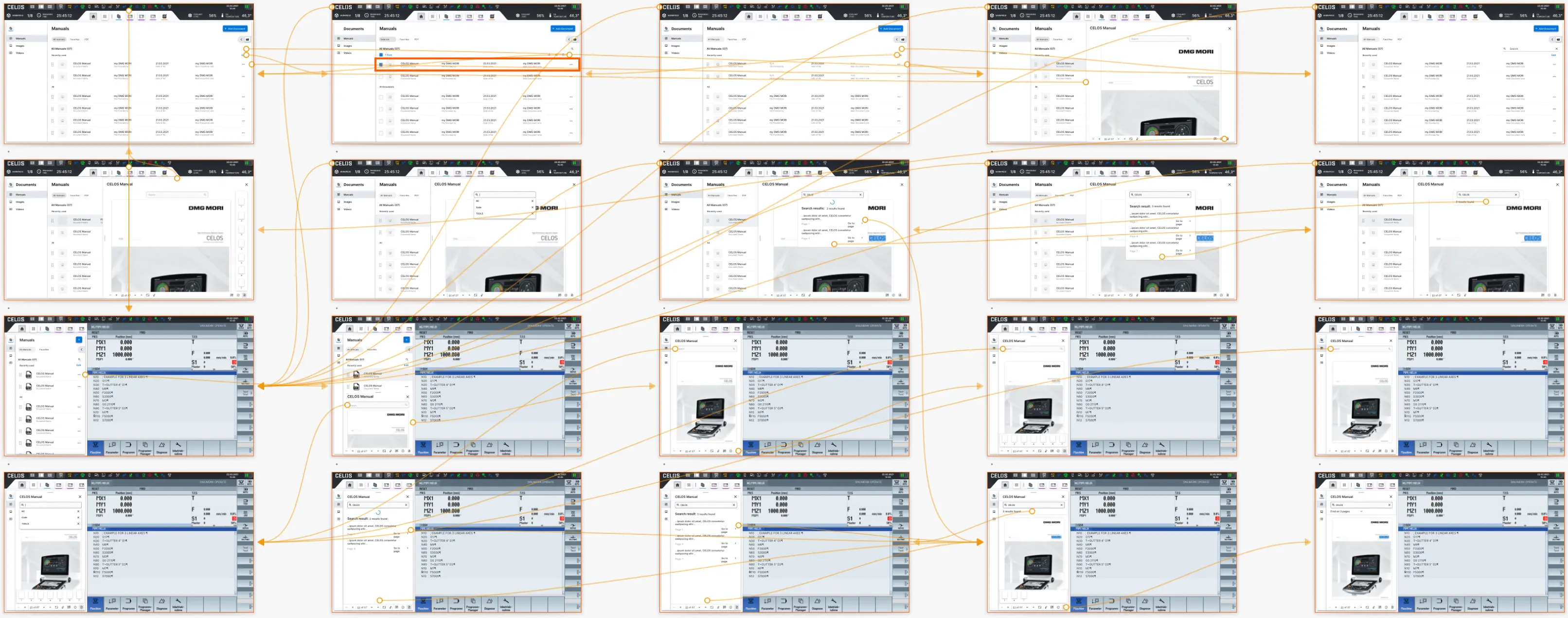
The design of the app according to the CELOS Layout shows on the left the side navigation with the sections: Manuals (documents), Images and Videos and on the right the content with various file informations and interface interactions. Also On the top bar is the CELOS apps navigation and current machine vital functions, as well as in the dark top bar the system navigation, machine and operator status.
_List_Documents_CELOSX_Siemens_Full.webp)
Key designs for the app are shown below. It displays the layout for the various screen sizes of the machine controls, including full and split-screen views of Siemens, as well as mobile. tablet and full-screen size of Heidenhain, and a two-thirds screen view of MAPPS.
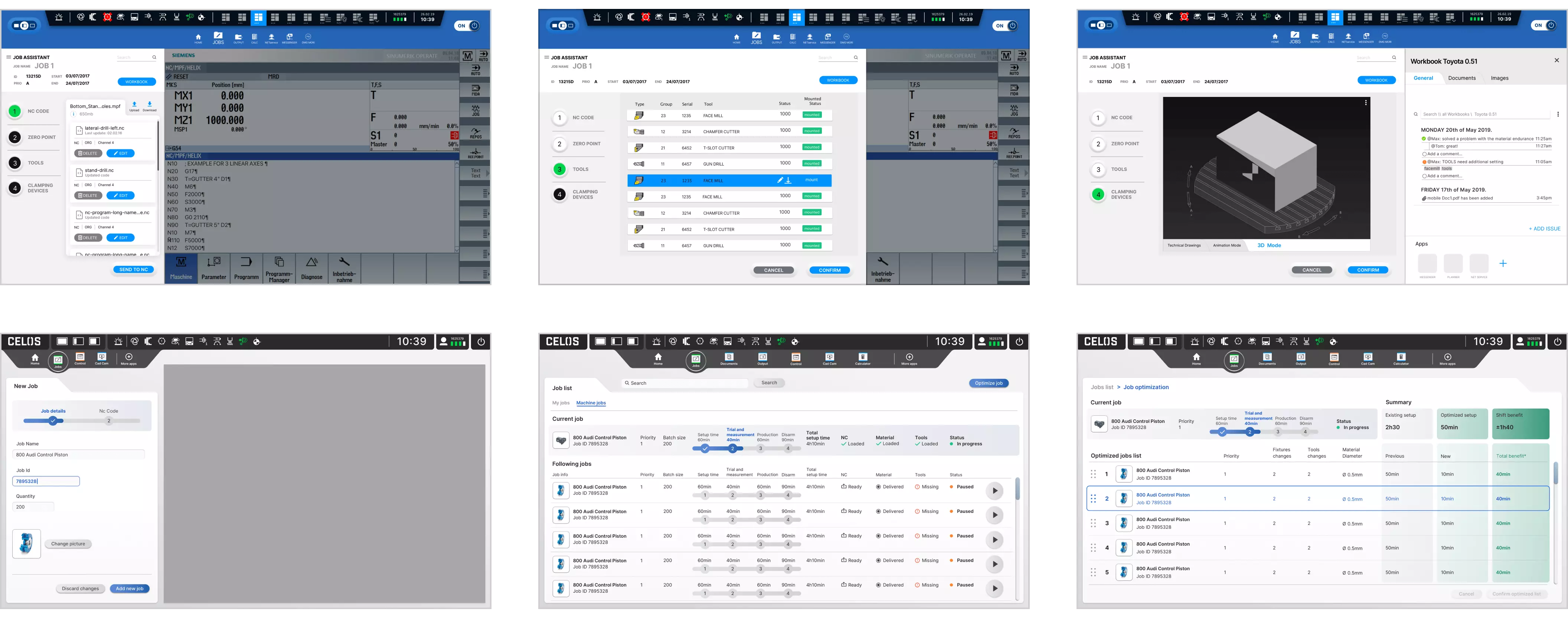
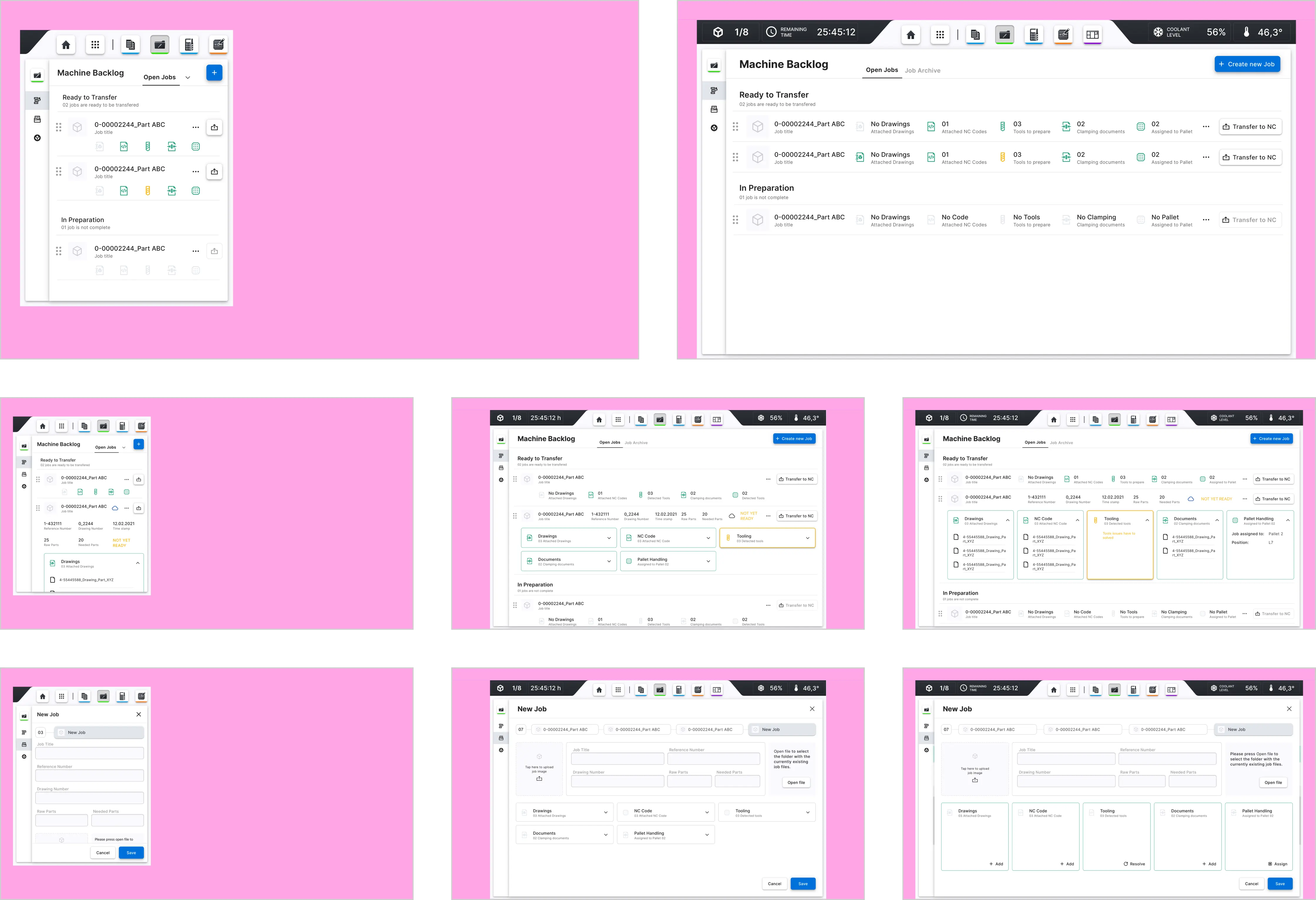
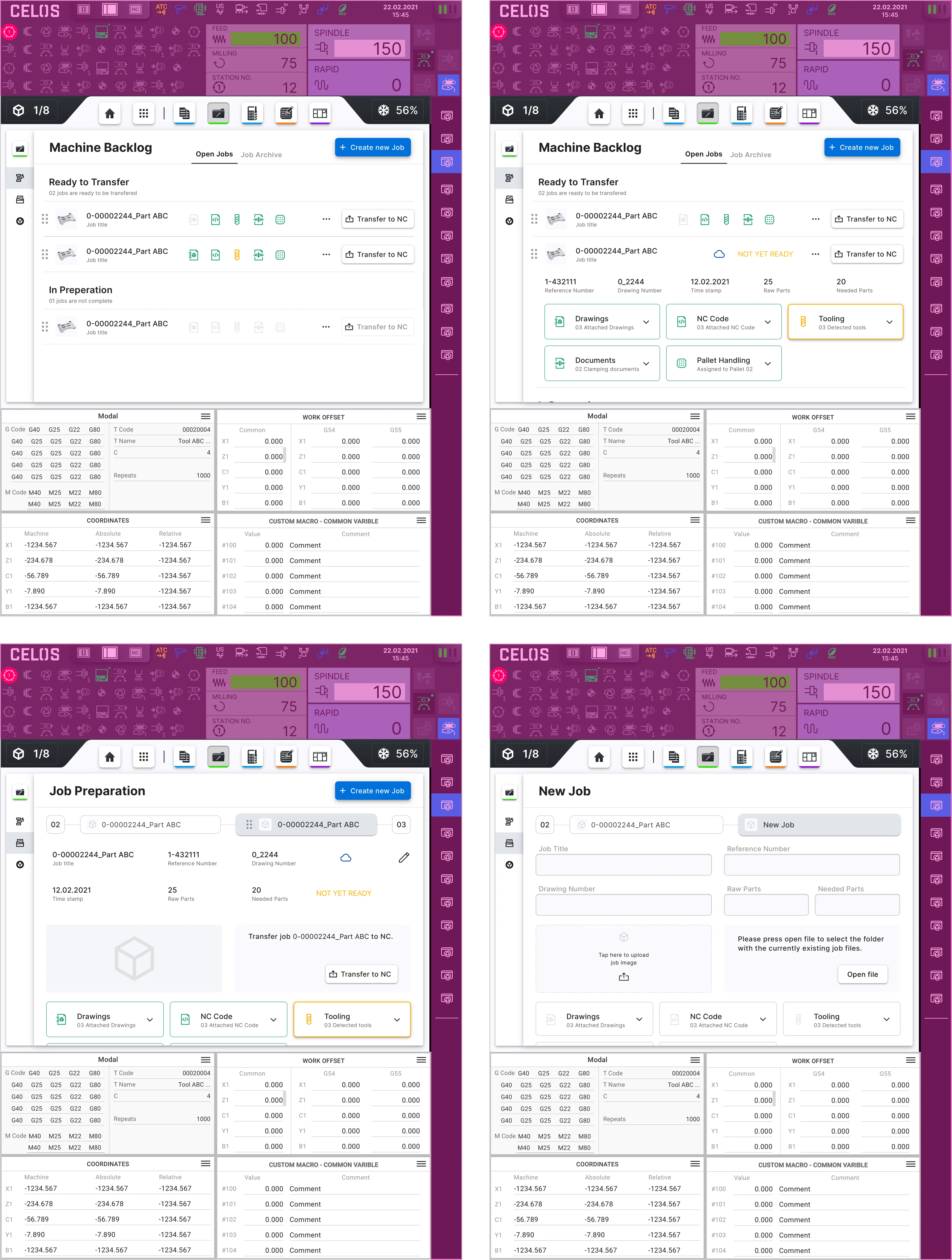
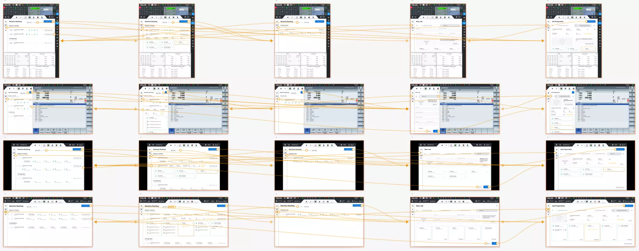
The design of the app according to the CELOS Layout shows on the left the side navigation. For example the start screen is the machine Backlog section where the job can be transferred and prepared. There is a drag and drop list status icons, settings, tabs for two views of the section: open and archive jobs, and primary action button with icon to create new job. The list cells with icon are expandable to see the related information file names, tool status etc. The second navigation section is Job Preparation where the user can see a queue of the jobs with details - Details: Werkstück image with function to edit it, editable job information wie title, cloud status etc.
on selected job from the queue and editing function. The queue is on the top of the content area.
Also On the top bar is the CELOS apps navigation and current machine vital functions, as well as in the dark top bar the system navigation, machine and operator status.
Key designs for the app are shown below. It displays the layout for the various screen sizes of the machine controls, including full and split screen views of Siemens, as well as mobile. tablet and full screen size of Heidenhain, and a two-thirds screen view of MAPPS. The design of the app according to the CELOS Layout shows on the left the side navigation.
An exciting step in the design process is digital prototyping. Teams can test and validate ideas using prototypes that resemble the finished product before presenting them to stakeholders and ultimately transferring the final designs to engineering teams for the development process.
In order to identify and address participants' user pain points during usability testing, prototypes are crucial. Therefore, to test user interfaces, interactions, and the way users interact with a product, I created high-fidelity prototypes as well as screen flows.
Please select filter for more content.
Screen flows include high-fidelity screens that are page layouts of the completed application. They are detailed and reflect the true size and visual appeal of a future product.
To meet the project's requirements and provide stakeholders and developers with an accurate representation of the finished product, I created screen runs of screen sizes with the greatest variance.